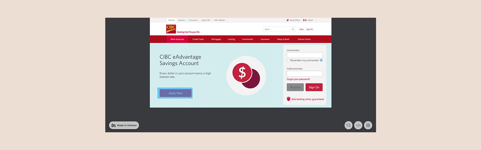
Faster credit product applications
Product applications were one of the lengthiest flows for CIBC customers. A sequence of over 40 screens and 20 minutes was the expected effort from potential customers. This was much too much. To help streamline a client’s product application experience, we identified the core steps to surface. Additionally, we enhanced input logic to pre-populate as much as possible and make it easy to spot what was still needed from the customer before fast tracking.
Role: Product Design Lead
Timeline: 7 months
Responsibilities: Product Design Strategy, UX/UI Design, Research, Design System Creation
Current Landscape
I spent time with BAs, tech leads and Product Owners to understand system constraints and key decisions that were made prior, to see how the flow could be improved.
The existing application form used multiple loading screens to retrieve and check information, and redundant questions to “validate” each step. Due to the lengthy forms, clients skimmed eligibility criteria which lead to 30% of all applications failing or requiring advisor assistance.
With this insight, I reviewed the E2E experience and identified steps that could be removed, combined, or improved with input logic.
Reducing cognitive load
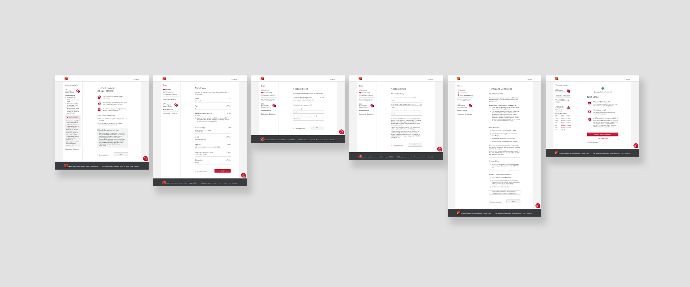
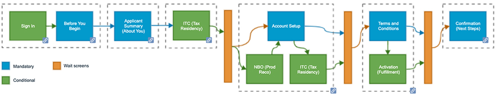
My first task was to reduce the number of steps and pages. I facilitated mini workshops with the team to see what could be changed, moved or removed and eventually created the flow below.
The flow consisted of five main parts: before you begin, client details, account setup, terms and conditions, and next steps. We had to account for some conditional screens, that could display based on authentication status, eligibility or information entered. Some conditional screens included client sign-in, tax residency status and down-sell offers.
Based on the complexity of information we needed to collect, our approach was to use a multi step form that included a step counter. This would guide users along and allow them to keep track of steps completed and what they could expect next. Related information was no longer spread across multiple pages, but instead combined onto one which eased cognitive overload.
If a client was signed in, the form would pre-fill most of the data entry fields, and skip authentication steps usually required with new clients.
Better data entry
One of the main issues clients raised with the existing application form was not knowing which fields on the About You screen were mandatory. Existing components lacked clear indicators, and contained placeholder text that made the empty fields look prefilled. Clients assumed fields were accurate and complete, but when they clicked “next”, error messages displayed.
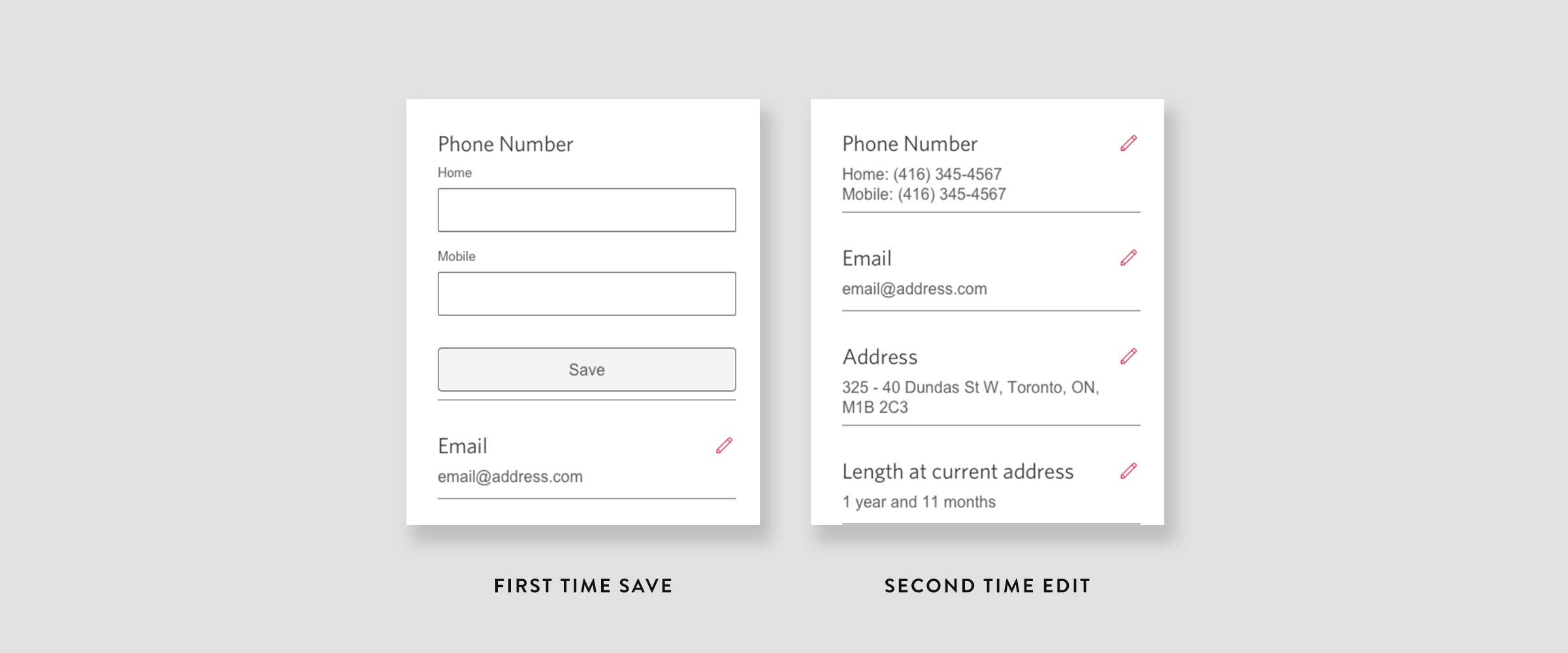
For EAO, since we were targeting existing clients, almost all data was prefilled and thus didn’t necessarily require input boxes unless being edited. This sparked a concept to have two states of fields: a collapsed state, and an expanded state.
If information was prefilled, then the field would load in the collapsed state. The collapsed state stripped fields down to just data entry presentation (no box, just the input) and our systems would not be required to re-validate previously validated information. If information was not prefilled, the field would load in the expanded state (empty field box). This helped clients easily identify which fields were “complete” and “incomplete”. This meant clients could proceed quickly to the next step if all fields were collapsed.
Real time, front end validation
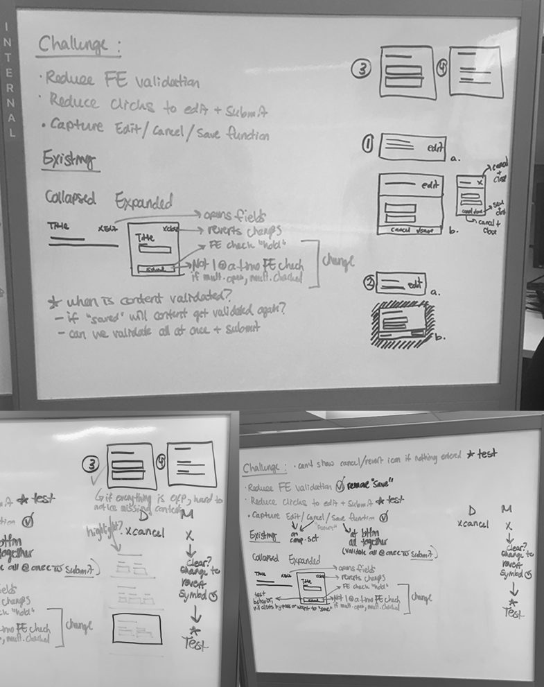
One of my favourite and most challenging pieces of creating EAO was including real time front end validation logic. No existing form had included real time validation, but our team was able to come together and create the solution. We pushed for this enhancement in stakeholder demos, since it helped clients self correct errors before submitting and provided us with more accurate information.
We mapped out possible input errors and messaging to properly build the logic and take note of technical constraints. Our conclusion was to group the logic into two buckets for submission: 1) was it complete, and 2) was it in an acceptable format.
Through testing, we noticed some clients completed expanded field states without clicking “save” before proceeding. This meant the information was not confirmed by the client, and our systems then stripped it from the field and presented an error that the field was empty. So we updated our front end validation to also detect if information being entered was new or modified. What this allowed us to do was assume the intent to change and still validate data even though the “save” button was missed.
Incomplete Button State
To visually help indicate what was happening with front end validation, we designed an inactive button. The purpose was to provide a visual queue when there was an error or incomplete data on the screen. We worked with developers and our accessibility lead to ensure we were creating an inactive colour state, instead of a disable button that would otherwise be missed by screen readers.
User Testing
Working with a research lead, I built a moderated usability test plan that probed customers on their thoughts of the updated components. Most customers didn’t even recognize a redesign change (the best kind of feedback), with few noting some minor feedback.
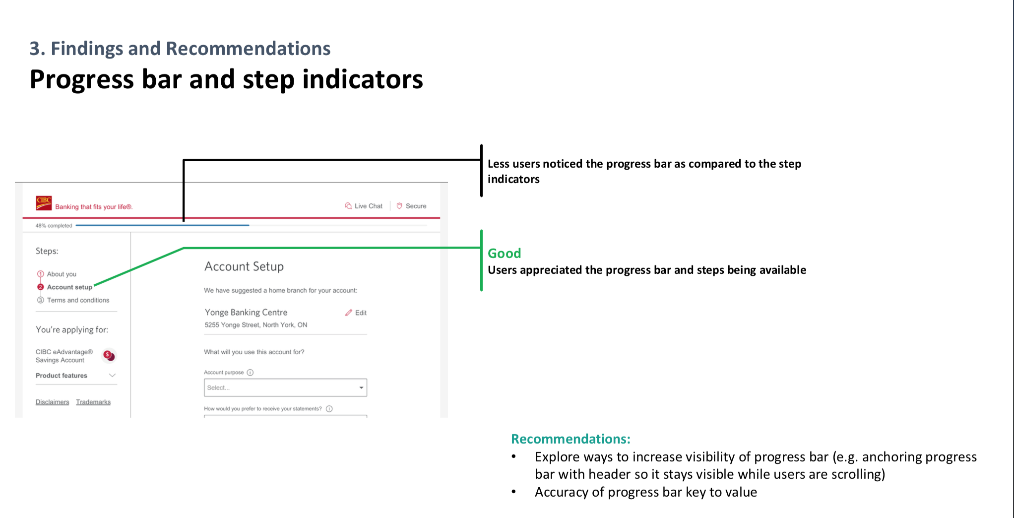
One of the components our users commented on was the progress bar. Users felt a progress bar was not needed since a step counter was present in the application. There was a marginal benefit to maintain the progress bar, and the component was only used within our sales applications, so our team decided to remove it entirely form our design system. One less component to maintain!
Change Log
During our project pilot, some of the defined styles needed to be updated based on functional testing and user feedback. I updated files every week for my engineering team, and used a change log macro in Confluence to comment what had changed between versions.
Feature Iterations
Mandatory Checkboxes
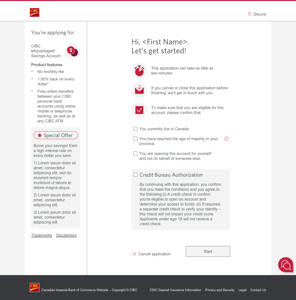
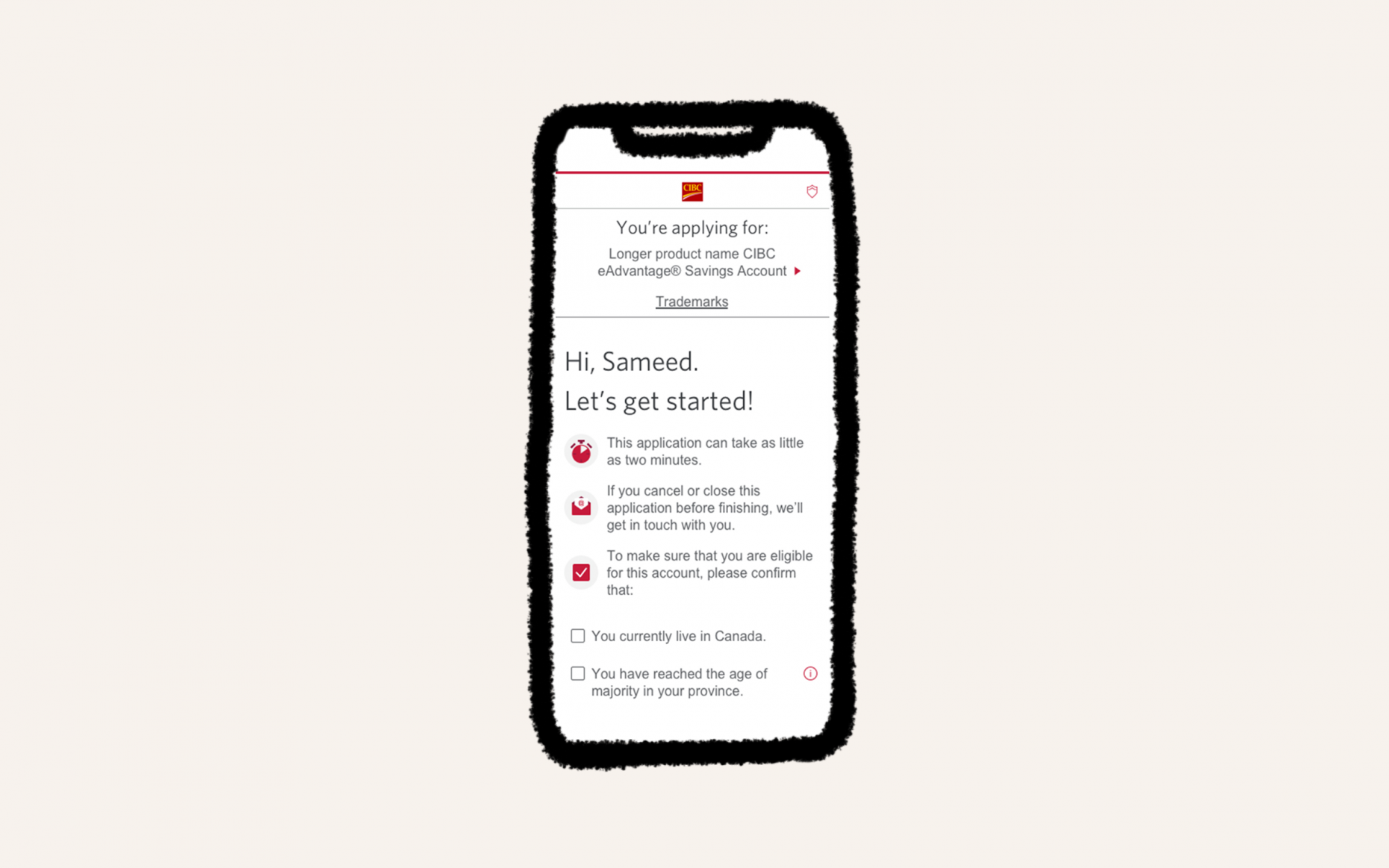
Clients were being rejected in other application flows, and not understanding why. This increased call volume. We discovered the main reason was that clients were skimming over eligibility criteria on the Before You Begin screen. To avoid this, we added mandatory checkboxes to confirm before proceeding. Through testing, clients understood the criteria was important and successfully confirmed the information. This change increased the number of successful applications we processed.
Sign In Screen
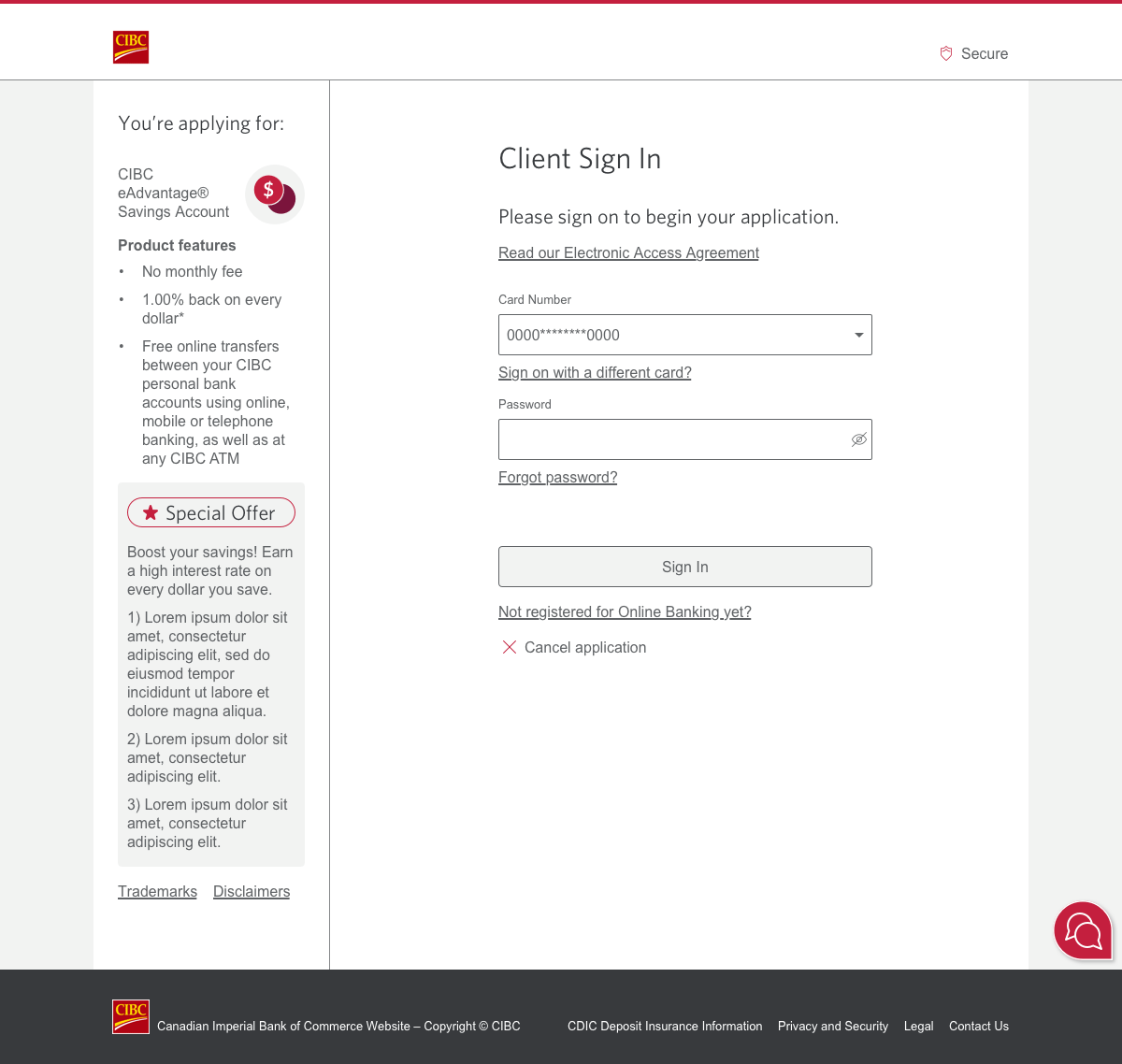
If clients were coming from targeted ads, digital marketing offers or our pre-sign on site, they would need to sign in before continuing with the application. We made adjustments to the sign in form for better consistency with other experiences and to include real-time validation behaviour. We also added an enhancement to “show password” for easier input; previously only used on our mobile app.
This new sign on functionality was later applied to all other product flows that required authentication to continue and applied to our main login screen. This shows that even small improvements can have big impact.
Branch Locator
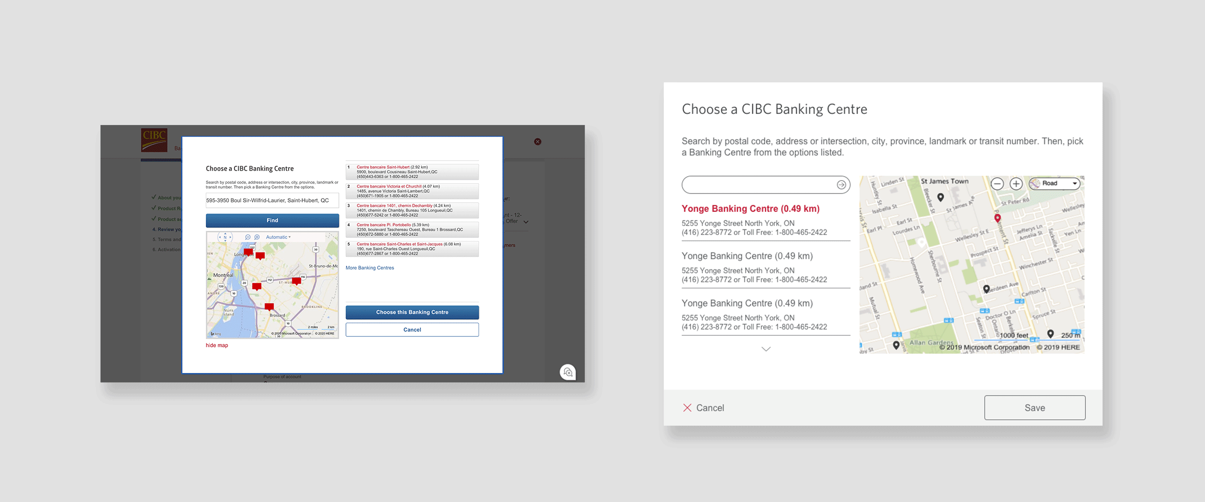
The current branch locator hierarchy seemed disorganized so we updated the layout to be consistent with common map UIs (Google, Wayz and Uber). For the search results, we moved them from the right side to the left, so they were positioned underneath the search bar.
For the map, we moved it from the left to the right and changed the location icons from what looked like dialog boxes to pins. We also included logic that allowed for default and selected states of the icon, so clients could more clearly see where locations were on the map.
Launch
We saw a huge increase in successful application completions and total conversion rate of 64.02%. This was considerable, against our typical application conversion rate of 23.7%, with an average completion time of 3 minutes and 16 seconds.