
Transforming Account Management for Enhanced User Focus
As the Product Design Lead for TELUS’ Onboarding program, I spearheaded the redesign of TELUS’s Account Overview page—a crucial touchpoint for newly onboarded customers. By aligning design strategy with user journey milestones, I delivered a modular, personalized experience that simplified account management while reducing cognitive load. The result was a 34% improvement in account-relevant content and a more engaging, intuitive interface that drove cross-team adoption across TELUS platforms.
Role: Product Design Lead
Timeline: 1-year phased delivery
Responsibilities: Cross-Team Alignment, Design Strategy & Direction, UX/UI Development, Design System Contributions
Establishing the Foundation
Rebuilding Stakeholder Confidence
When the business product team’s initial designs failed to resonate with stakeholders, I was brought in to realign the project. My role required hands-on leadership to navigate competing priorities, secure stakeholder buy-in, and craft a roadmap that set the stage for success.
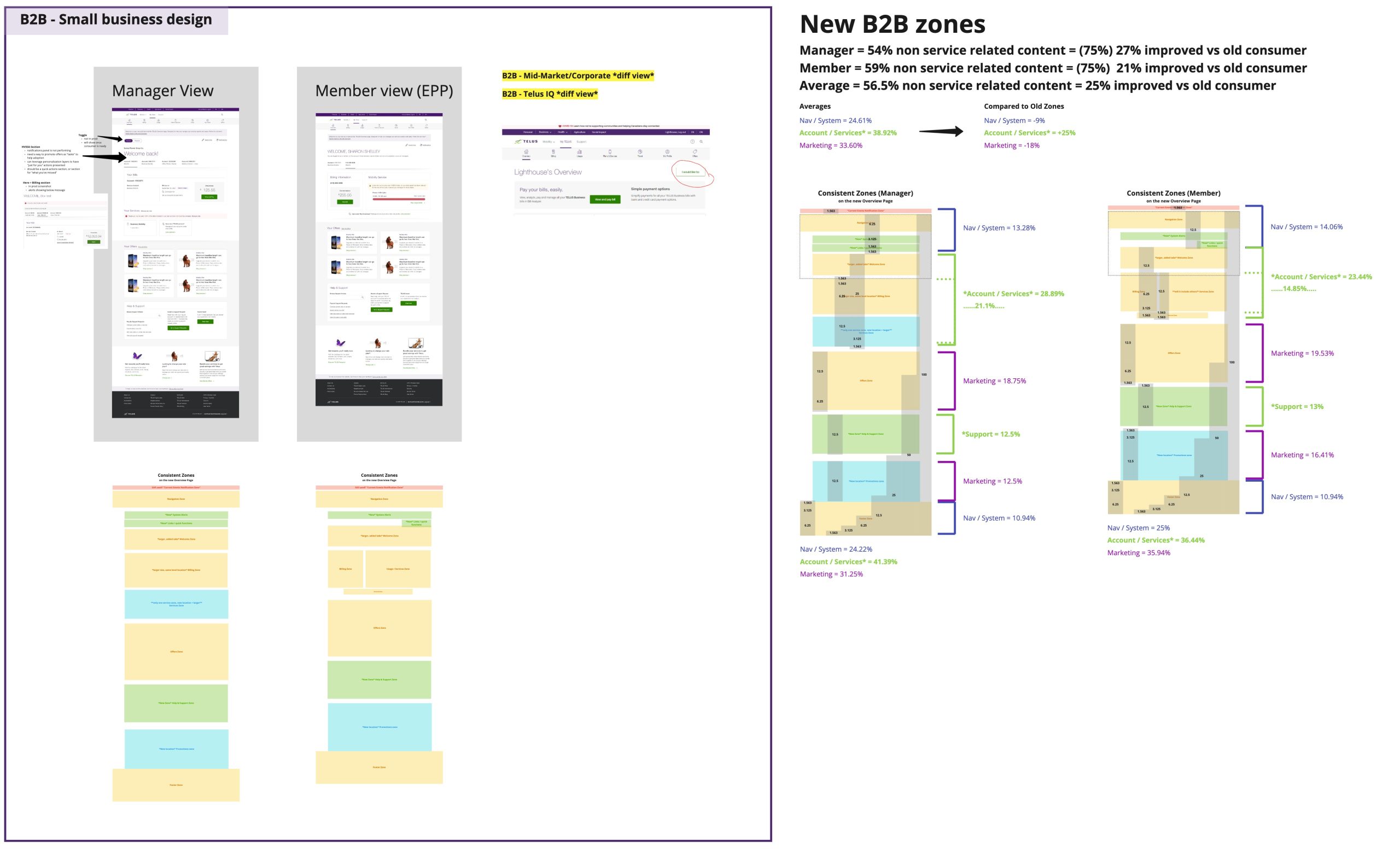
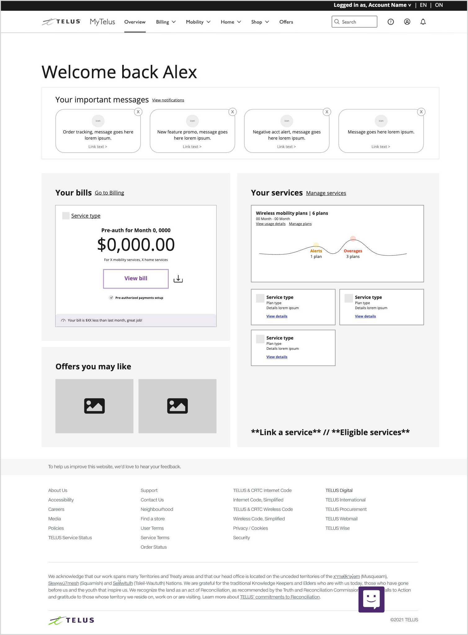
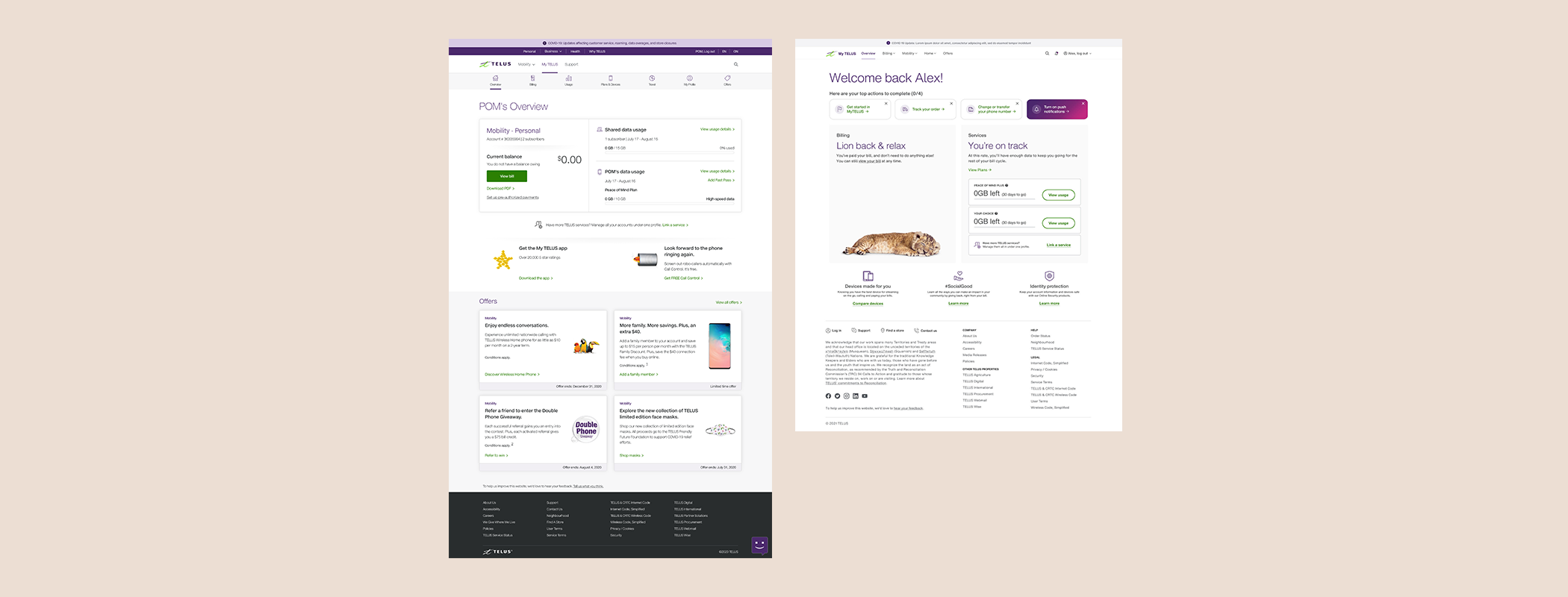
Original Personal Account Dashboard

B2B Concept (used as baseline for new approach)

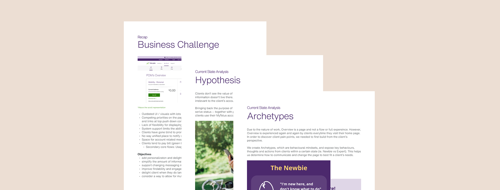
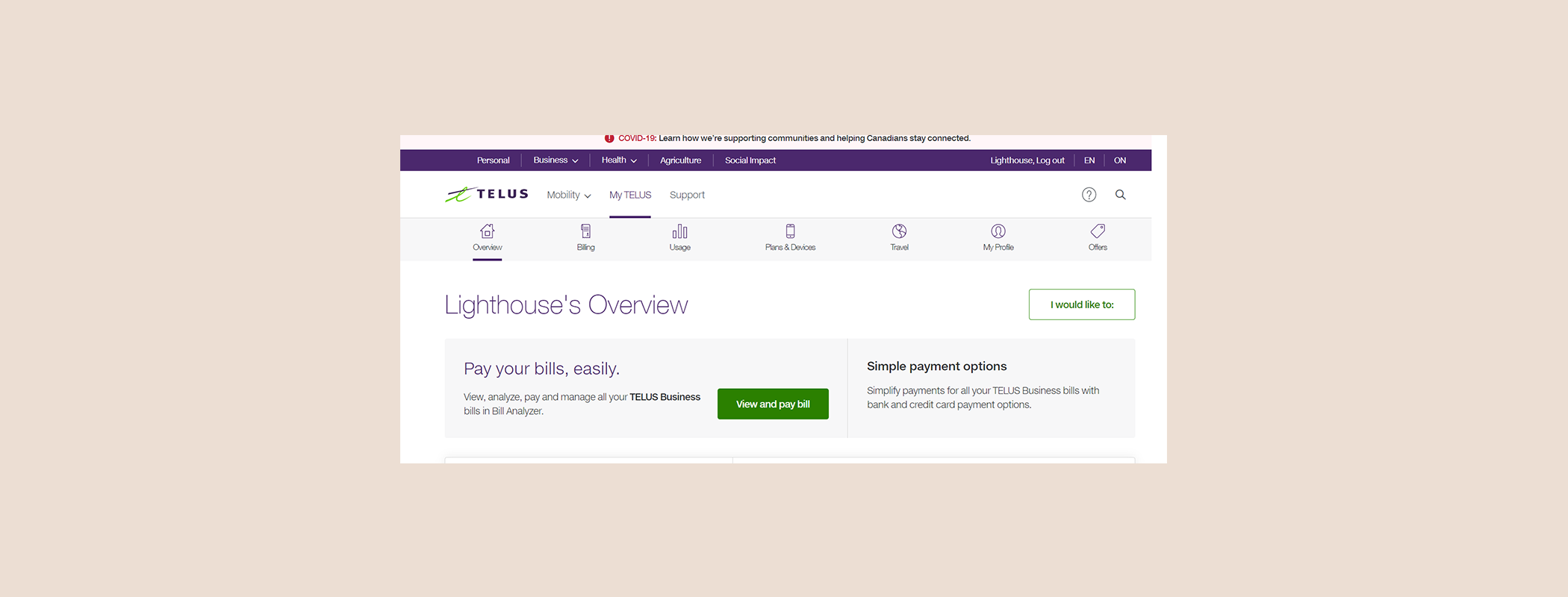
Understanding the Current State
The Overview page, serving as a static destination rather than a dynamic flow, required content adaptable to varying client account statuses, lifecycle stages, and services. I conducted an extensive audit of the existing experience across devices, provinces, languages, and segments.
Actionable insights revealed pain points, supported by data from the Center of Excellence (COE) leads, which I presented to leadership to emphasize the urgency of improvements. Key findings included:
- 75% of content was marketing-oriented, offering minimal user value.
- Poor information architecture led to overwhelming and irrelevant content.
- Mixed use of outdated and new design components impaired usability, especially on mobile.
Through collaborative sessions with product, marketing, tech, and business teams, I quantified the risks of inaction and gained leadership support for prioritizing a redesign.
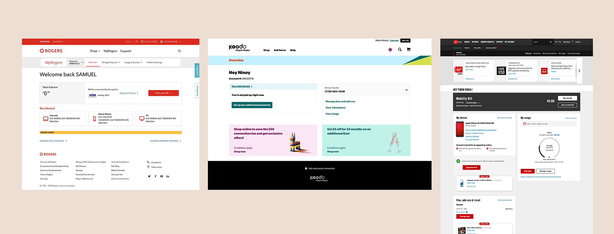
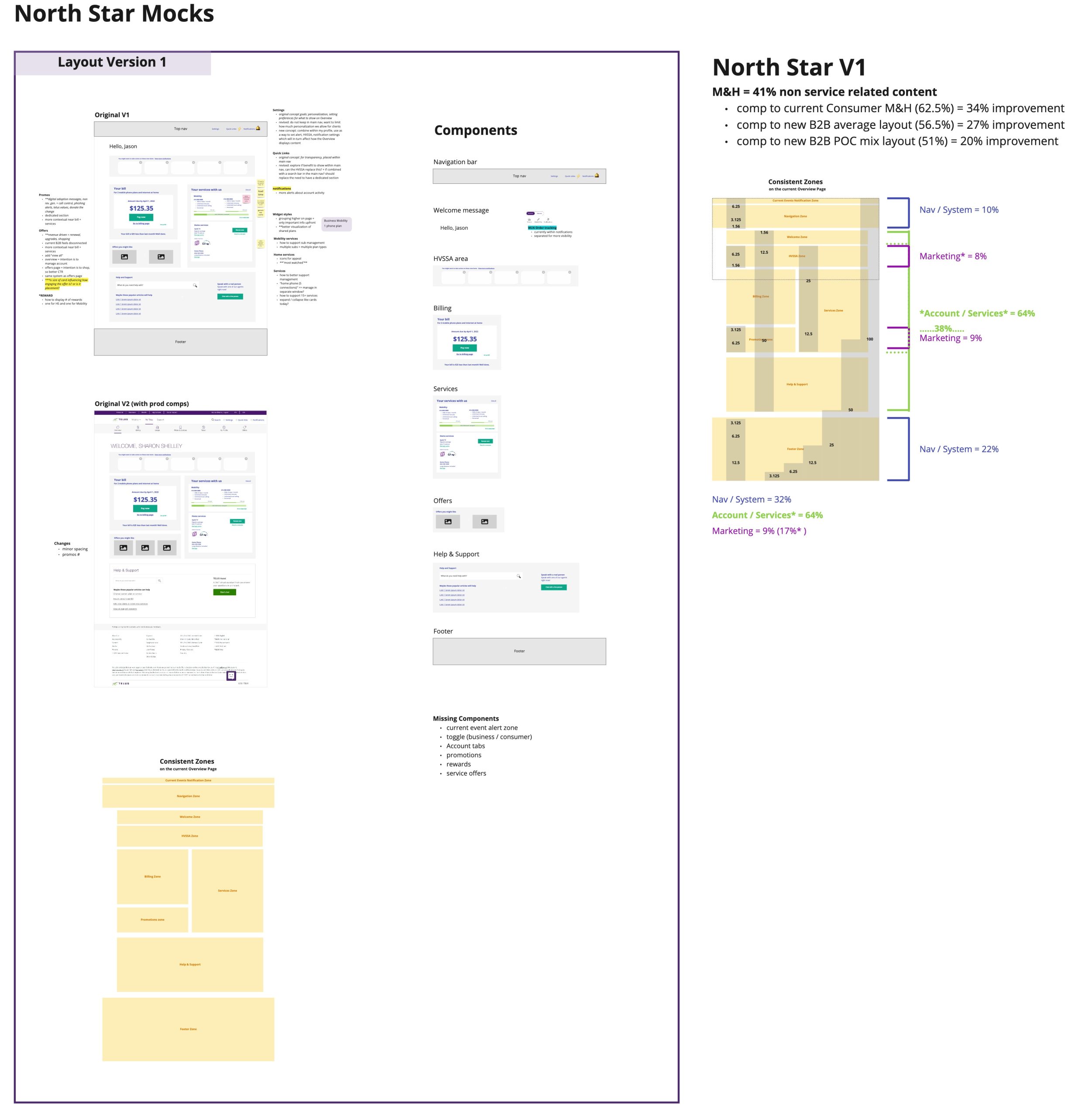
Competitive Analysis
To align user expectations, I analyzed competitor experiences. Most relied on widget-based layouts for flexibility. Leveraging these insights, I aligned stakeholders on a modular design direction to address TELUS-specific challenges and support scalability.
Cross-Functional Discovery
To ensure the redesign addressed organizational needs, I facilitated workshops with product owners and technical leads. This exercise uncovered critical gaps and elevated the redesign’s importance across teams.
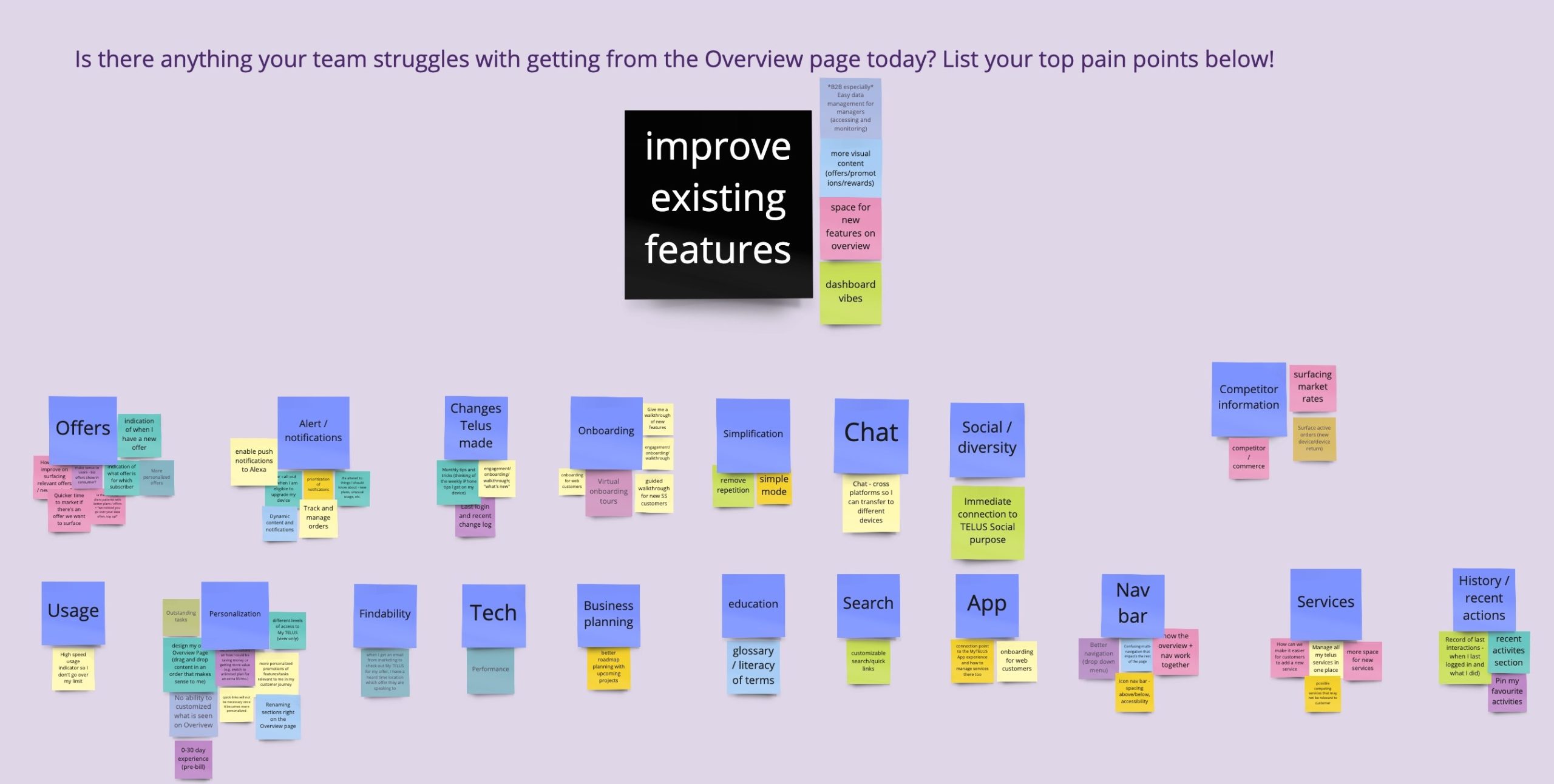
User Research
I collaborated with the business product team to refine usability testing plans, adding customer-focused questions to uncover actionable insights. We conducted moderated and unmoderated tests to evaluate the current and proposed layouts, focusing on comprehension, navigation, and behaviour. Key insights included:
- Customers ignored page content and relied on “green buttons” for guidance.
- Users prioritized managing bills over all other actions.
- Navigation inconsistencies prevented users from exploring new features.
These findings validated pain points and inspired a broader navigation redesign to improve usability.
Delivering the Vision
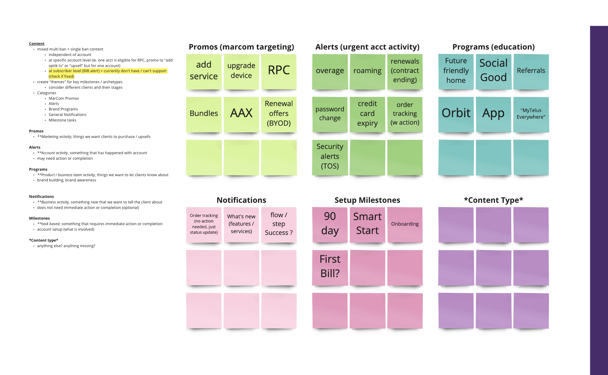
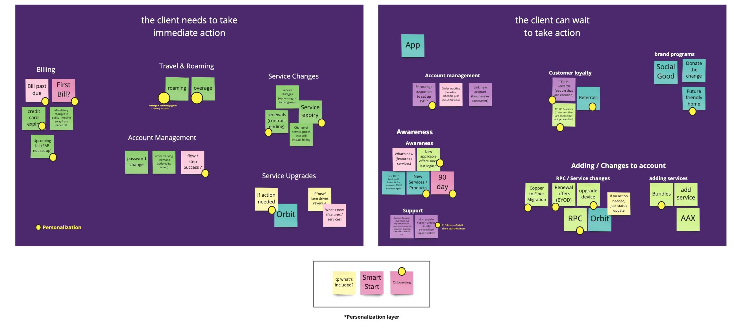
Content Alignment
Guided by the goal to make the Overview a true “snapshot” of account tasks, I led workshops to categorize and prioritize content based on urgency and relevance. This exercise drove decisions to consolidate, hide, or remove unnecessary elements, ensuring a clean and focused interface.
Go-to-Market Planning
Using an Impact/Effort Matrix, I worked with technology leads to balance quick wins with long-term improvements to sustain stakeholder momentum and ensuring high-value improvements were implemented efficiently.
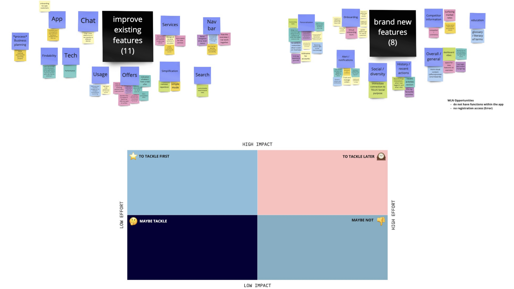
Planning and Prioritization
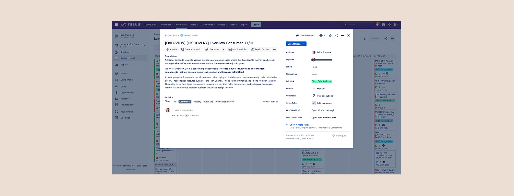
Working with delivery teams, I outlined Jira user stories, ensuring alignment with definitions of ready/done. Features were mapped from the Impact/Effort matrix to phase improvements for delivery.
Innovating Design Components
Modular Exploration
The existing MVP concept failed to leverage updated design system components. I advocated for redesigning the layout into modular widgets, splitting exploration between myself and another designer. By assigning purpose to each section, I ensured that components aligned with both user needs and technical constraints.
Quick Links & Help Redesign
I addressed usability issues with the “I would like to:” Quick Links and the Help section, which were hidden or misaligned with user expectations. Redesigns made key actions more accessible, improving clarity and reducing mental load.

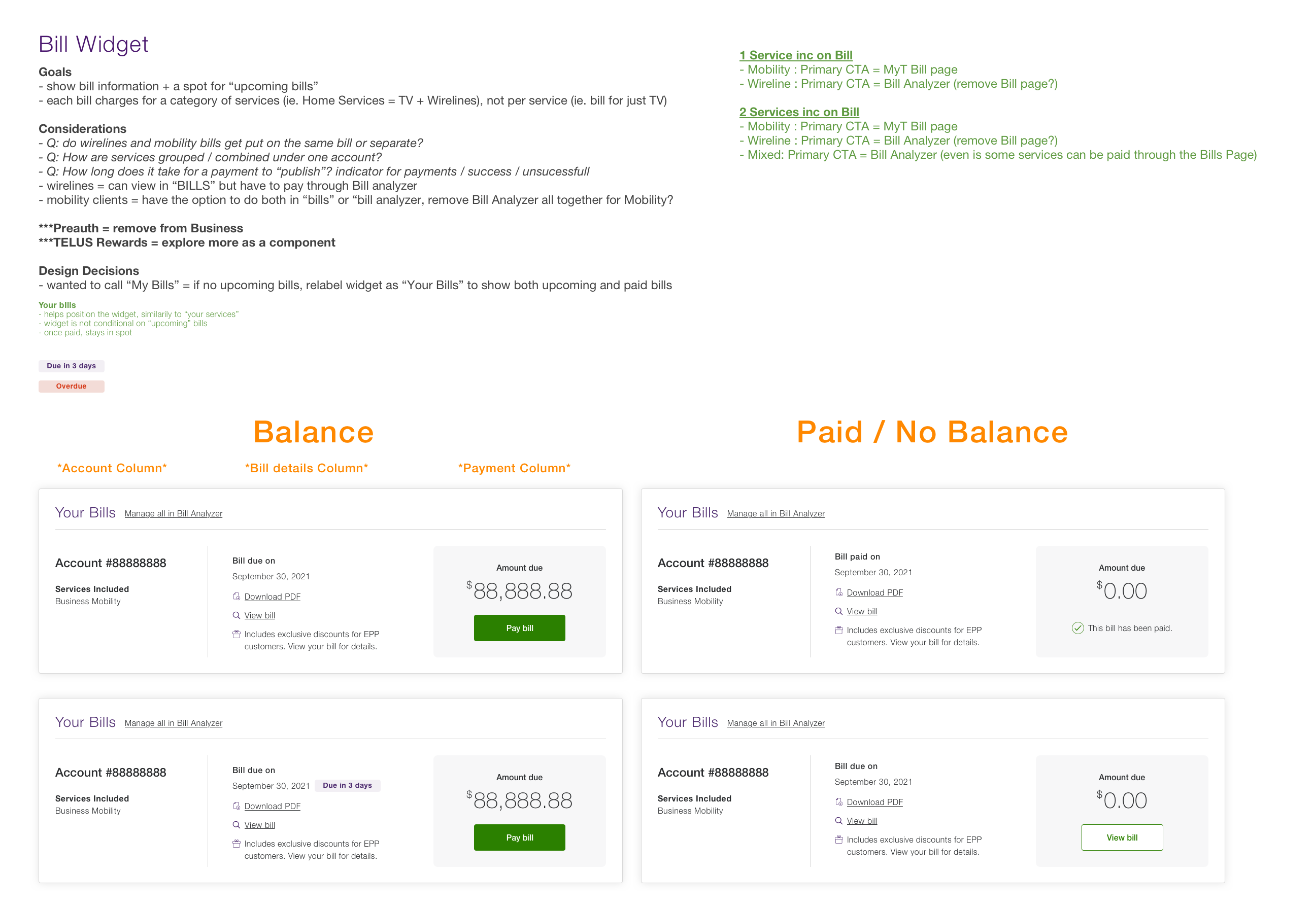
Dynamic Billing Widget
I proposed intuitive interactions for a dynamic billing widget, that tailored the user experience to real-time needs, such as surfacing critical alerts and hiding irrelevant information.
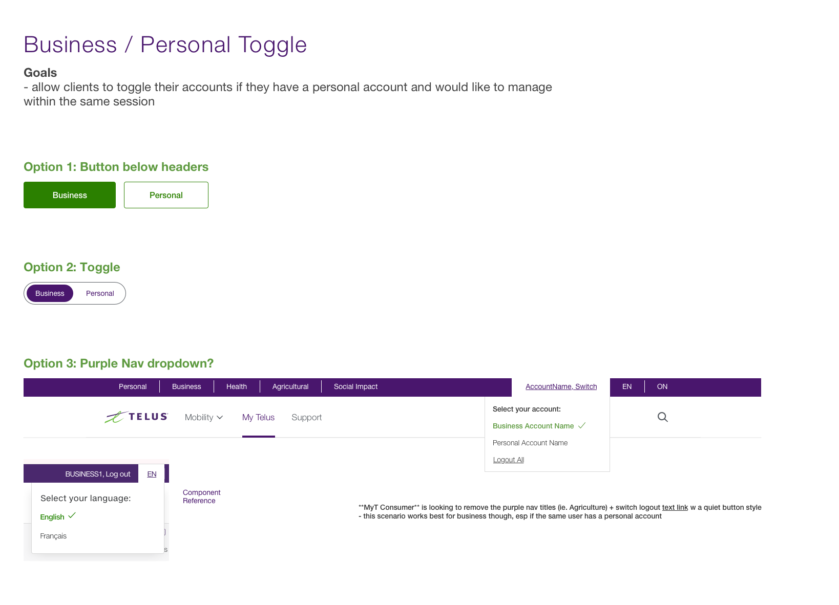
Account Toggle
Proposed an industry-standard switch button for seamless account toggling, enhancing user flow efficiency.
New Direction
Myself and the Business Product team designer began exploring the art of possible. We leaned into the “snapshot only” concept and began stripping away all unnecessary information. Updates included: new navigation bar, new account toggle placement, notifications moved into the sub navigation bar opening drawer menus instead of modal overlays, dedicated top actions area for contextual messages, dynamic billing and services cards, and lastly, contextual offers that rotate regularly.
When I assessed the new layout, even with new sections added, we had improved the level of account related content by 34%, and increased value above the scroll!
Real-Time Insights
While technical constraints prevented the implementation of real-time behavioural insights (ie. account spending and usage trend reports), I introduced this concept as a long-term vision to enhance customer education and retention.
Delivering Customer-Centric Design
A Personalized, Intuitive Experience
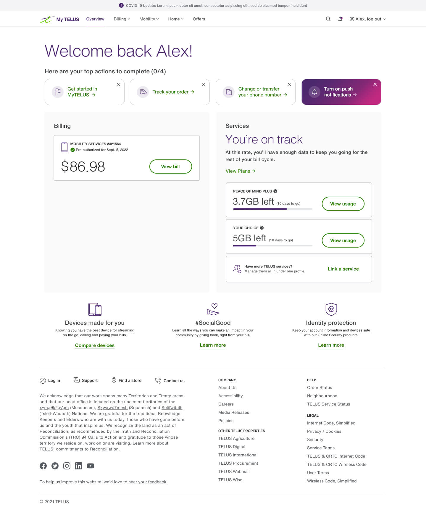
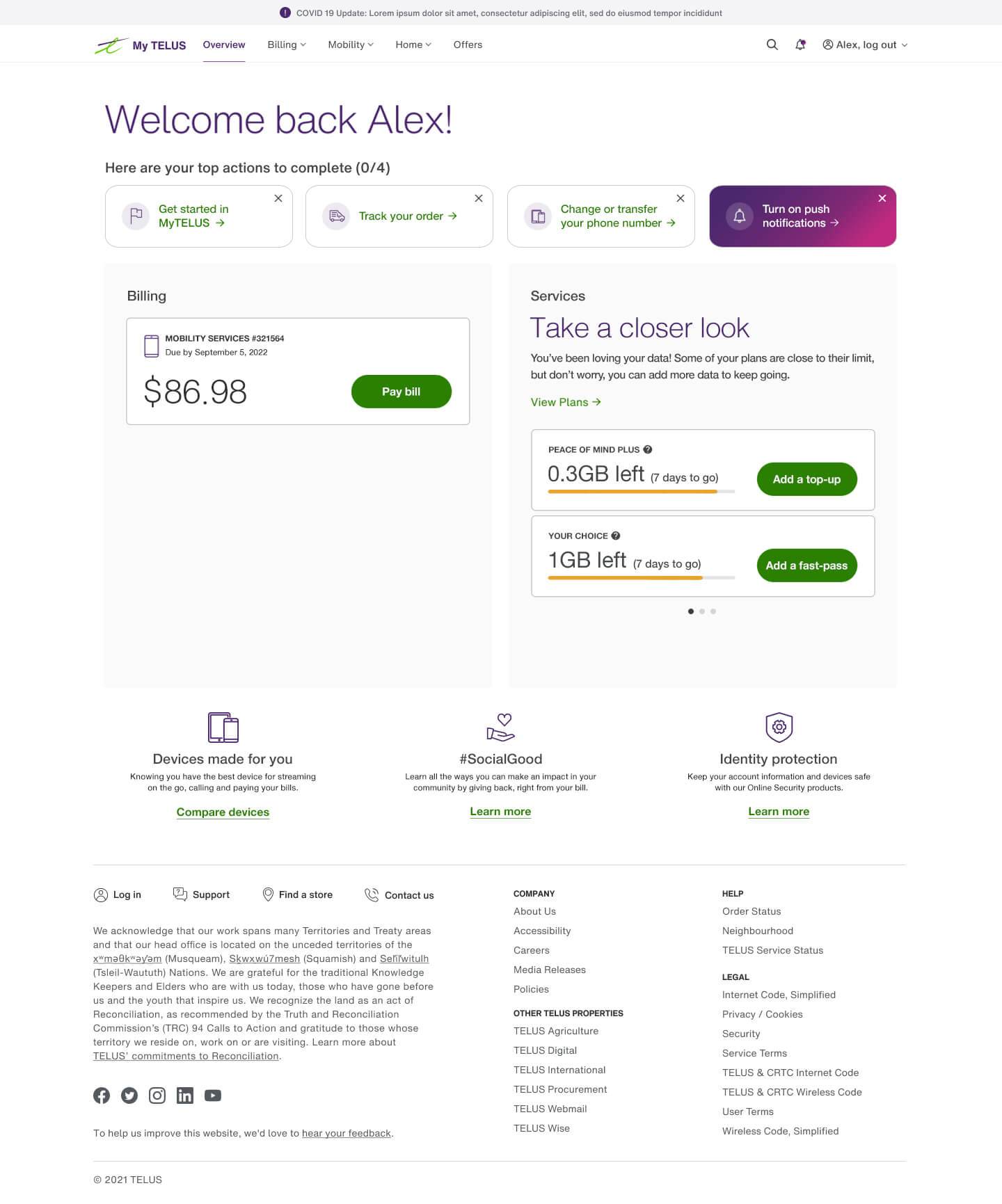
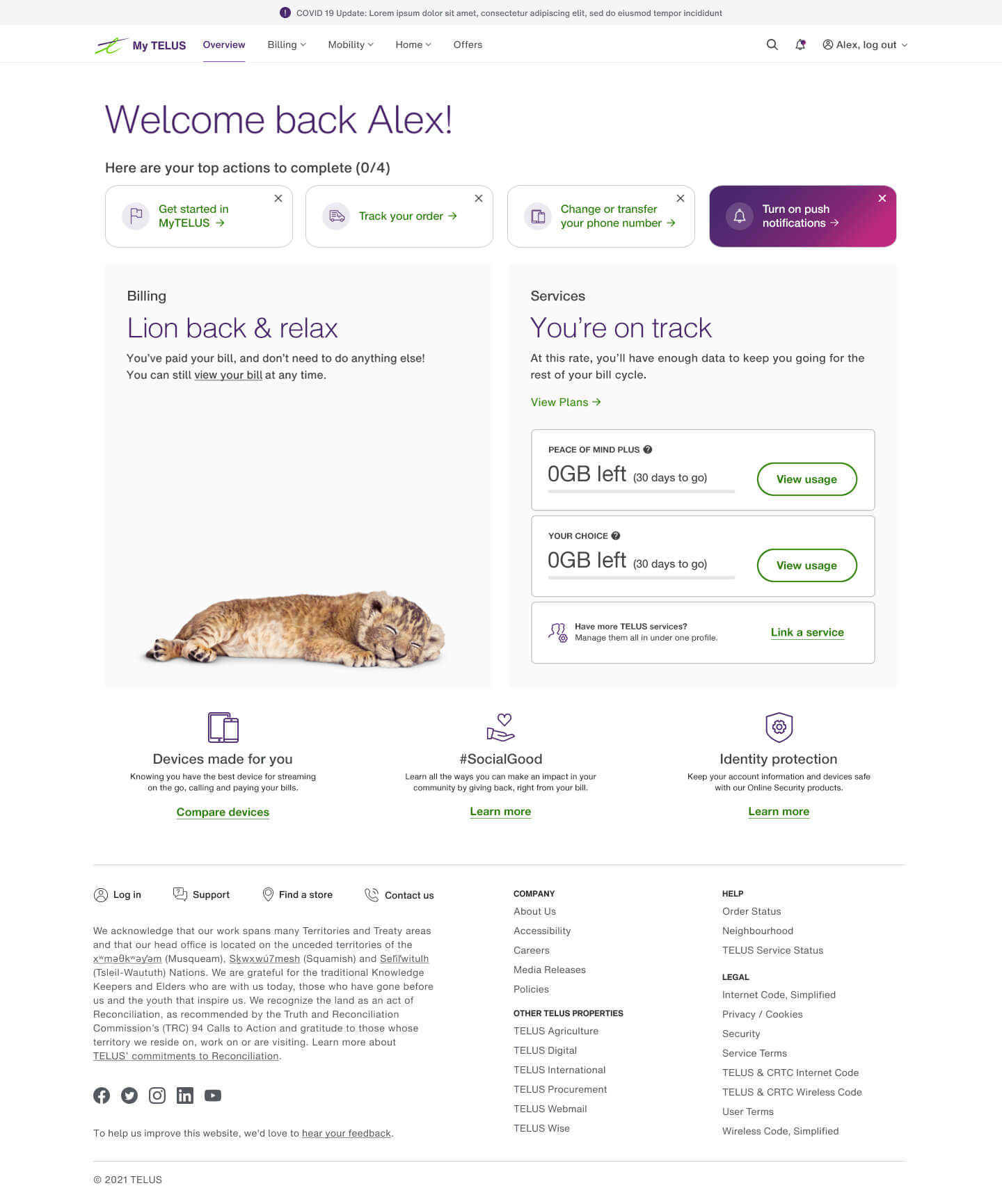
The final design featured widgets with dynamic states—pending, active, alert, and paid—customized to real-time account statuses. Improved content hierarchy, iconography, and colour made complex information easier to digest.
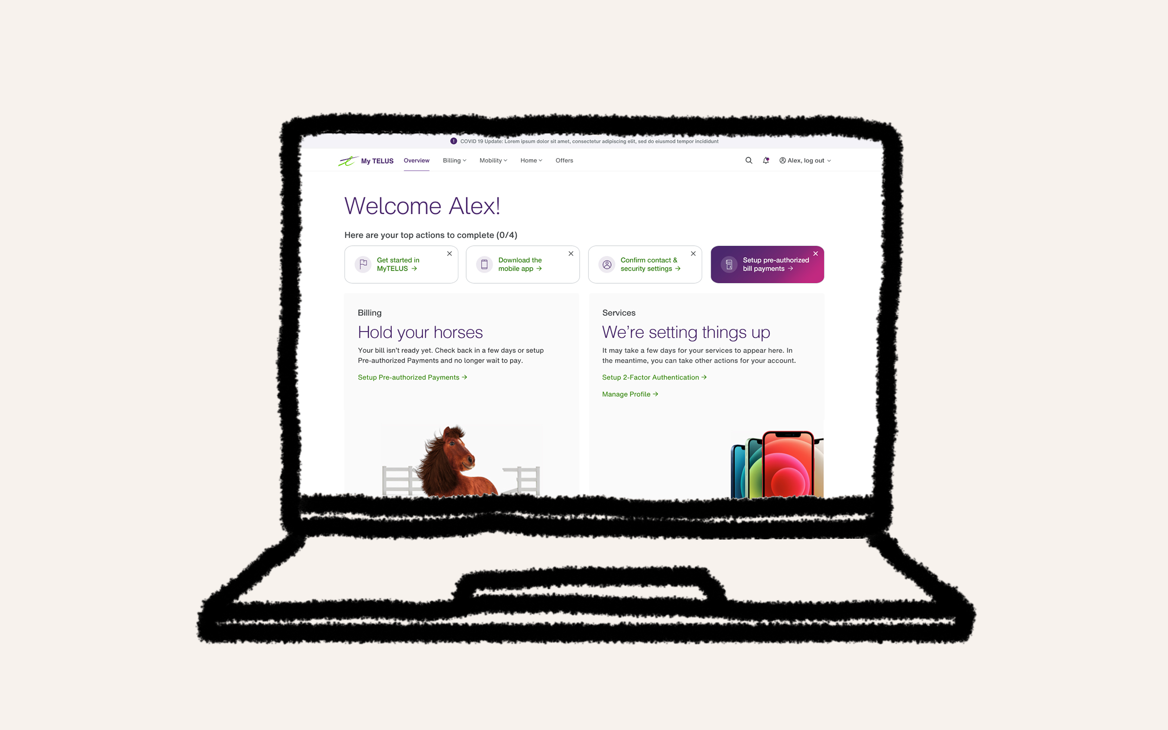
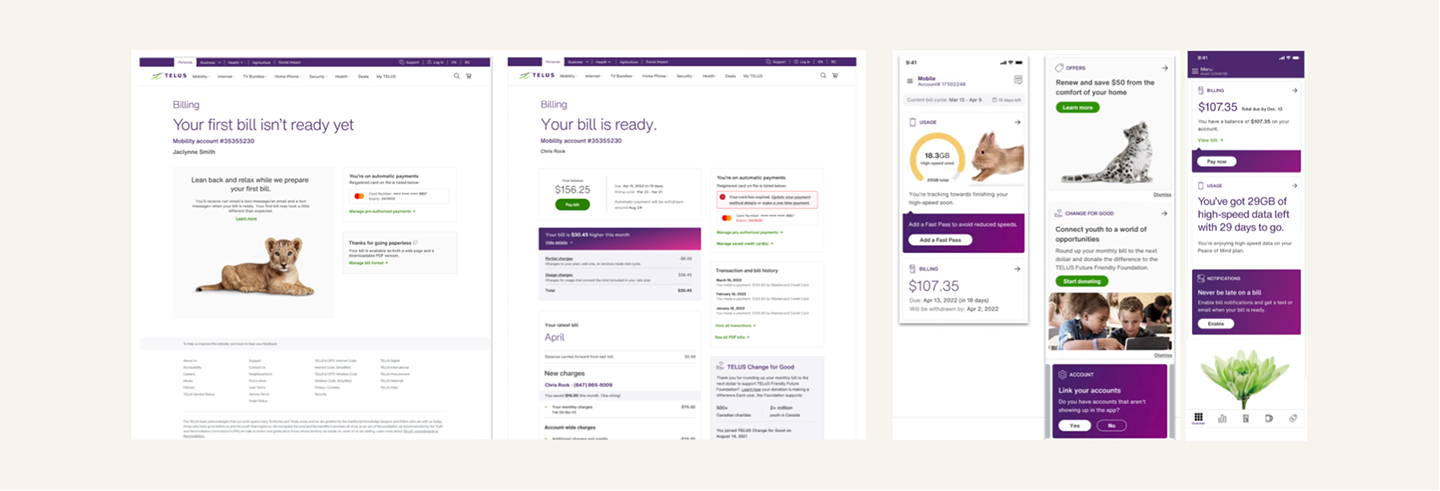
Pending state
For newly onboarded clients, I designed a “pending” state that guided new customers to complete critical onboarding tasks (e.g., app setup) while suppressing promotional content. This approach reduced distraction and improved service activation rates.
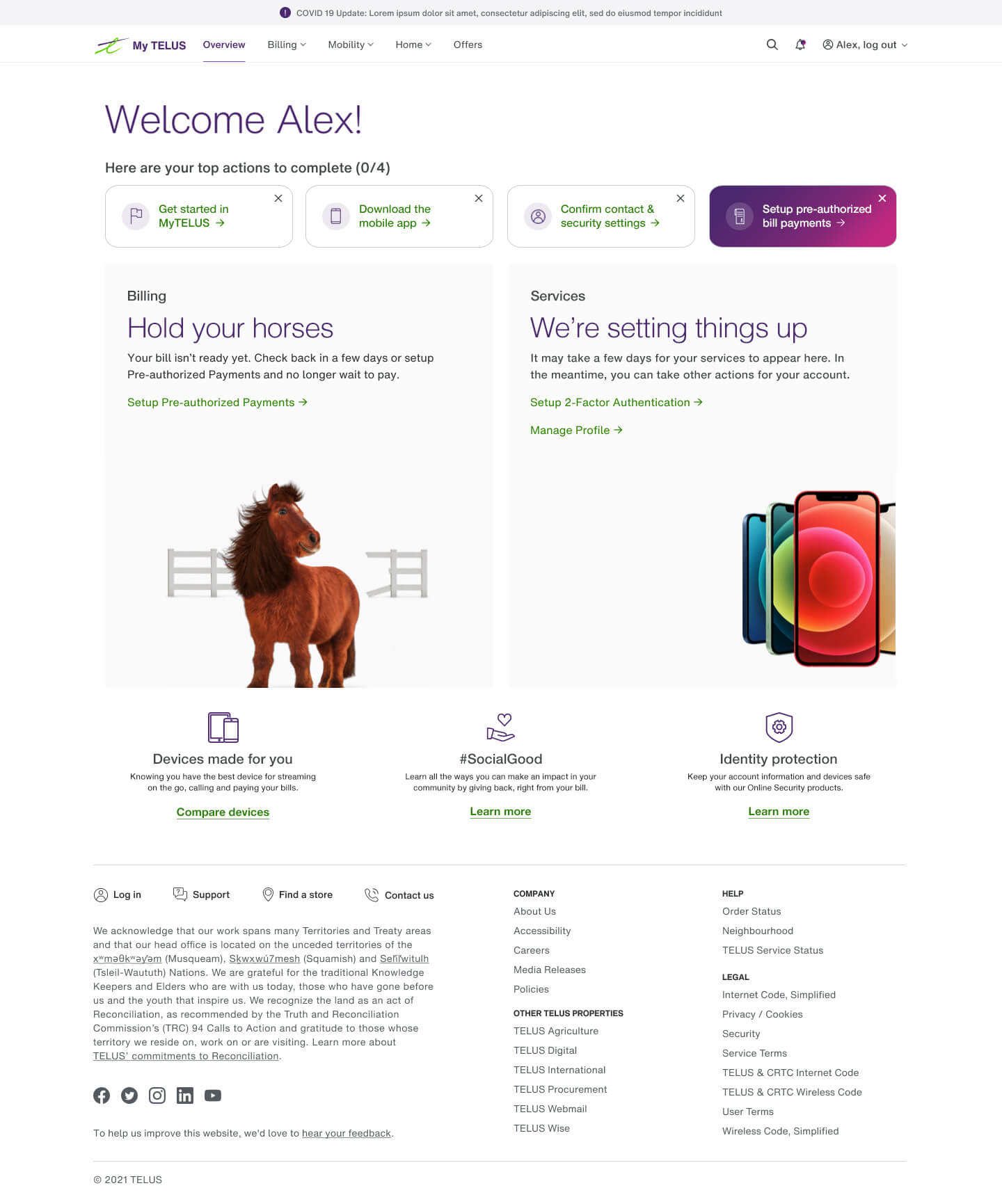
Active state
Once services were activated, widgets dynamically adjusted to highlight actionable alerts, using clear visual cues for urgent actions, reducing user anxiety about missing an alert.
Paid state
Upon bill payment completion, the UI celebrated milestones with positive reinforcement while keeping actions accessible. Suppressing unnecessary actions while reinforcing positive user behaviour helped keep the experience focused.
These enhancements improved the proportion of account-related content by 34% and significantly increased value above the scroll.
Driving Cross-Team Adoption
A Blueprint for Success
The success of the Overview redesign inspired other TELUS teams to adopt its modular layout and design principles.
- App Integration: Native app teams implemented the widget style, colour system, and logic to ensure consistency across platforms.
- Billing Team Alignment: The billing team used the redesign as a foundation for their bill statement overhaul.
Impact
The redesigned Account Overview page successfully balanced user-centric design with business goals. By simplifying account management and tailoring content to lifecycle stages, the project elevated the customer experience and set a new standard for TELUS’s digital platforms.