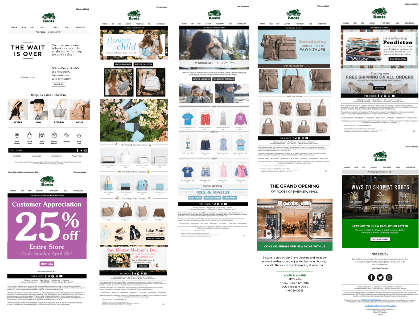
Increasing conversion by 64%
I lead hands-on design and strategy to reimagine Roots Canada’s email marketing. The result was a completely elevated brand tone with consistent application, using the power of story to convert shoppers.
The results: over $720K additional sales in six months, $300K in OPEX savings through tool and process optimization, and a reduced bounce rate of 2% from 45%.
Role: Lead Designer
Timeline: Phased over 1 year
Responsibilities: UX/UI, Visual Design, Branding, Design System, Coding, Analytics, Accessibility
Improving efficiency
I didn’t initially plan on redesigning Roots’ newsletters. I had absorbed newsletter design and coding responsibilities when a team member moved out of our department, and truthfully followed status quo. But then I ran into road blocks I couldn’t fix. Code was breaking and the team didn’t know how to solve them without an email developer, we were driving up QA costs in Litmus, and photography assets were sent to us up until the deadline. There needed to be a better way.
QA Proofing Code Snippets
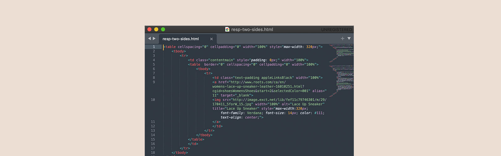
When I asked my design manager and previous designer how they solved code errors, they mentioned pulling from previous emails that worked, but couldn’t articulate why those emails worked. And so, with my very basic HTML and CSS skills, I started scrubbing code to understand. What I found was single div boxes unnecessarily wrapped in multiple divs and wrappers, and contradicting styling. I cleaned our code to only keep the essentials (without breaking) and then documented “clean” code snippets into a single source of truth (sublime file). Now I could easily copy and paste code snippets that I trusted to work, so what once took two days to solve, now took me an hour to implement. That’s a 90% increase in efficiency!
Simplifying Templates
When reviewing documented template layouts in our brand guidelines, I noticed there were two layouts the team rarely used. When speaking with our marketing lead, they did not have enough historical data to assess performance; so together we made the decision to remove entirely. The removed templates were also unlike any I had seen competitors use, so safe to say we made the right decision.
Taking Inventory
As a retail brand, Roots’ marketing team would often repurpose content from the previous year. However, since updating code and layouts, older email content needed to be redesigned to fit with our current specs and branding. This lead me to audit a year’s worth of emails, and update for reuse.
What I found instead, were newsletters without clear call to actions (lack of buttons?!), inconsistent branding and tone of voice, overwhelming amount of product images, non-responsive designs, and image-based content with flattened text. Without brand guidelines crafted specifically for newsletters and no code snippet repository, I could understand how newsletters ended up this way.
And so, I knew I needed to at least build consistency for our newsletter experience. This is when I advocated to lead brand and experience strategy for our newsletters.
Discovering the Opportunity Space
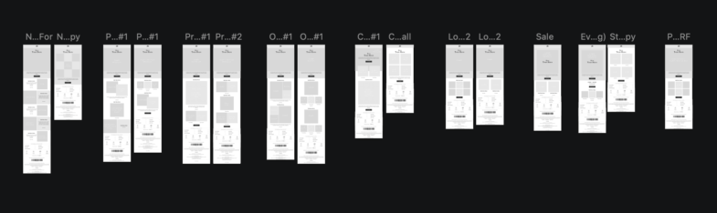
Phased redesign effort, focused on foundational behaviour tracking to test and iterate from. Some of the tasks carried out were creating mobile first templates, rewriting code to be accessible, responsive designs that scaled to any desktop and mobile view port, and new elevated design system.
Learning from Competitors
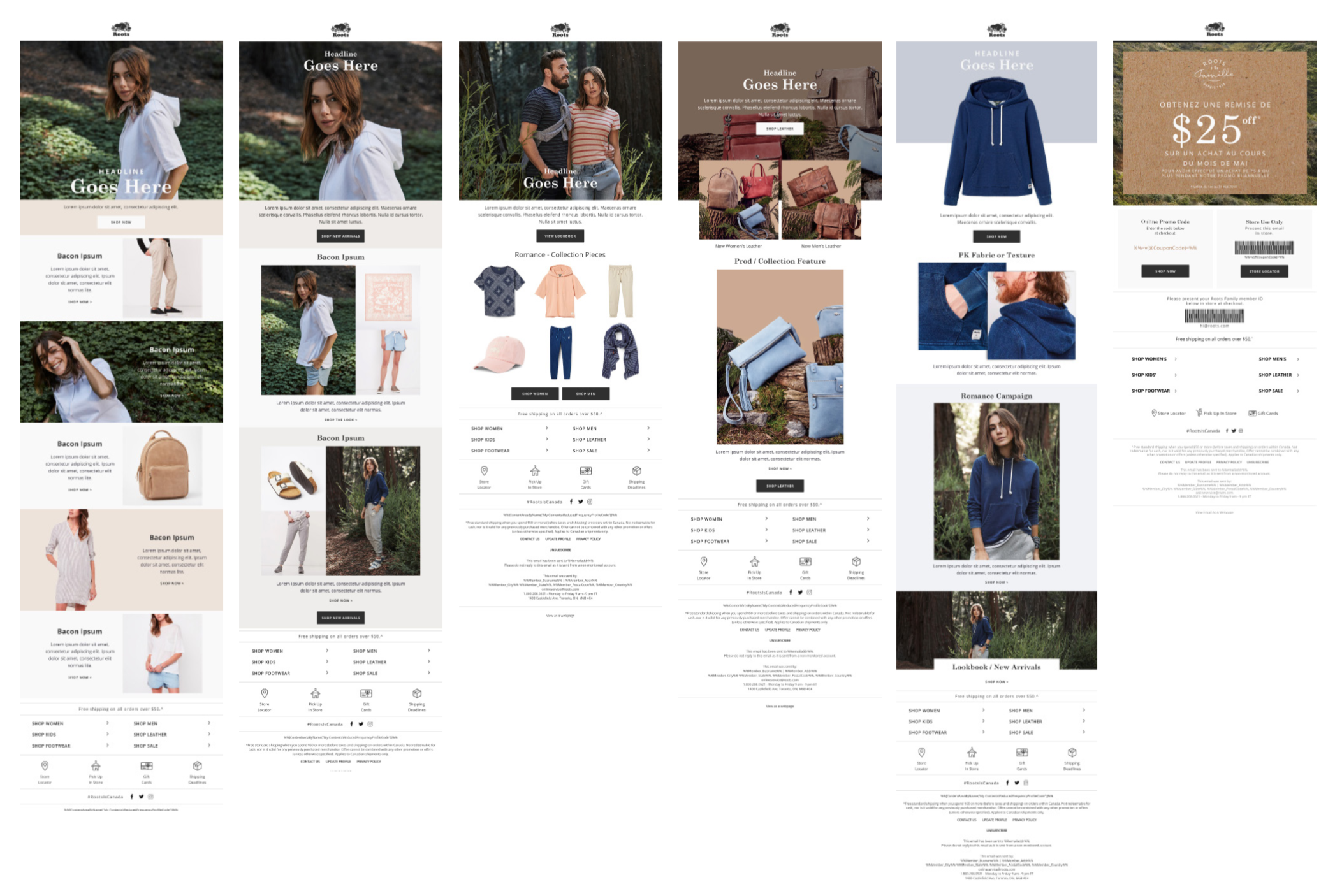
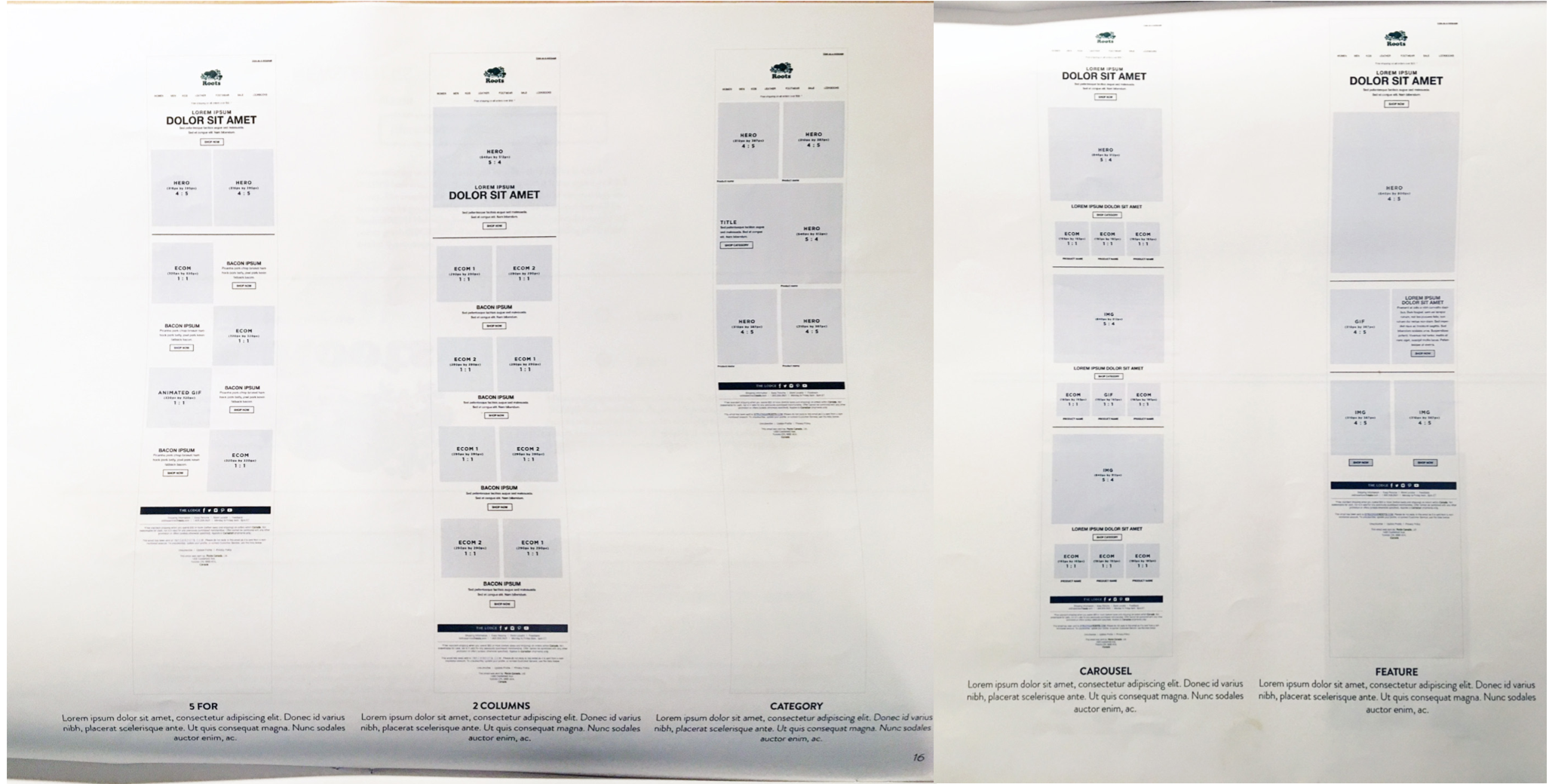
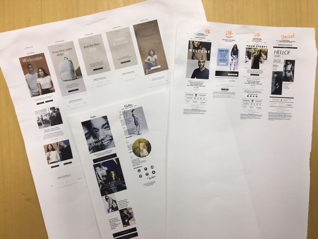
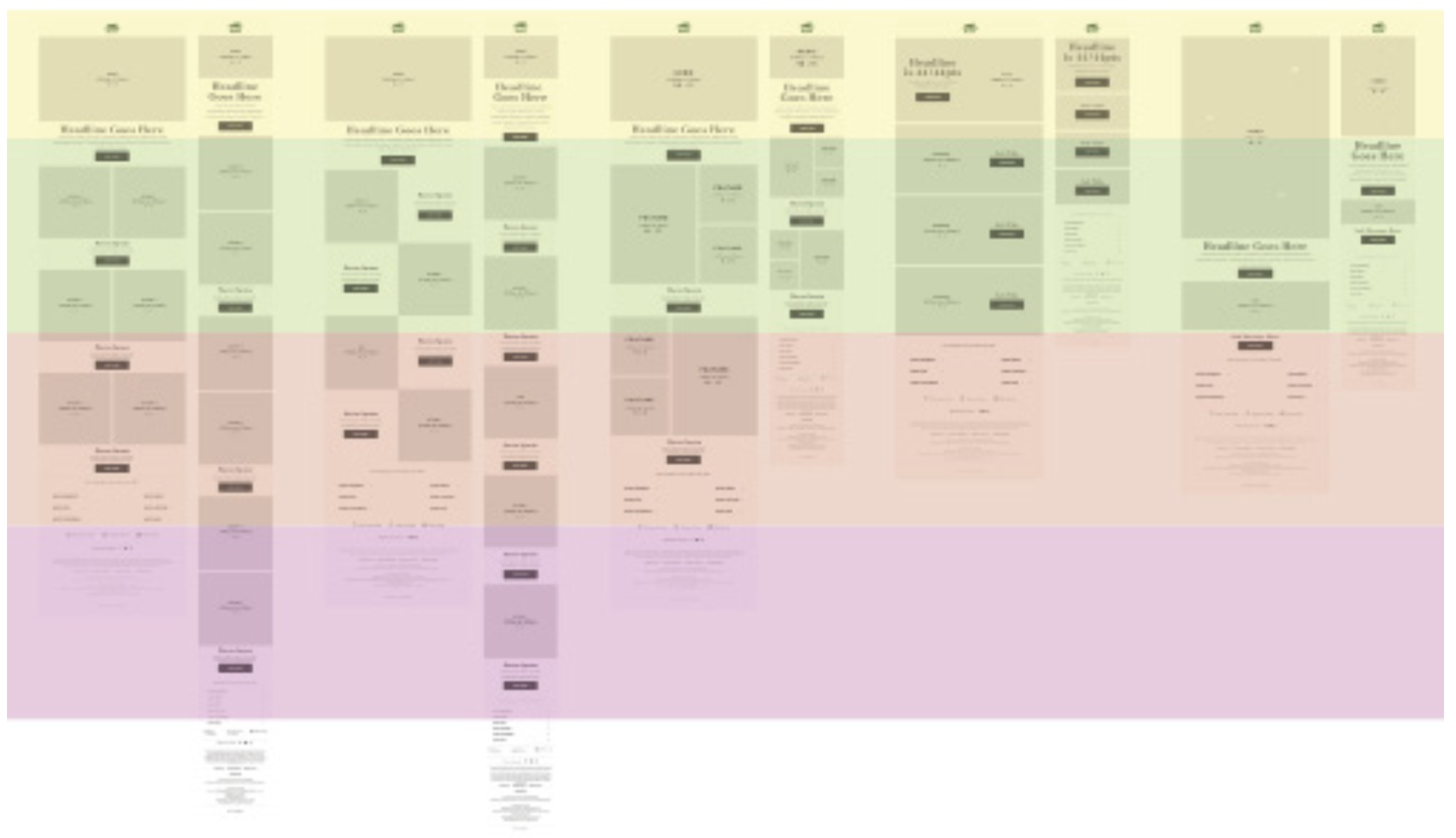
Since designing for newsletters was new to me, I signed up for a ton of competitor newsletters so I could learn what their approaches were. I tracked frequency, layouts, tonality, and branding to find any logical patterns. What I started to notice was consistent cycling of specific layout styles, that I lovingly classified as “outfit building”, “product”, “lookbook” and “new and featured”.
Exploring the art of possible
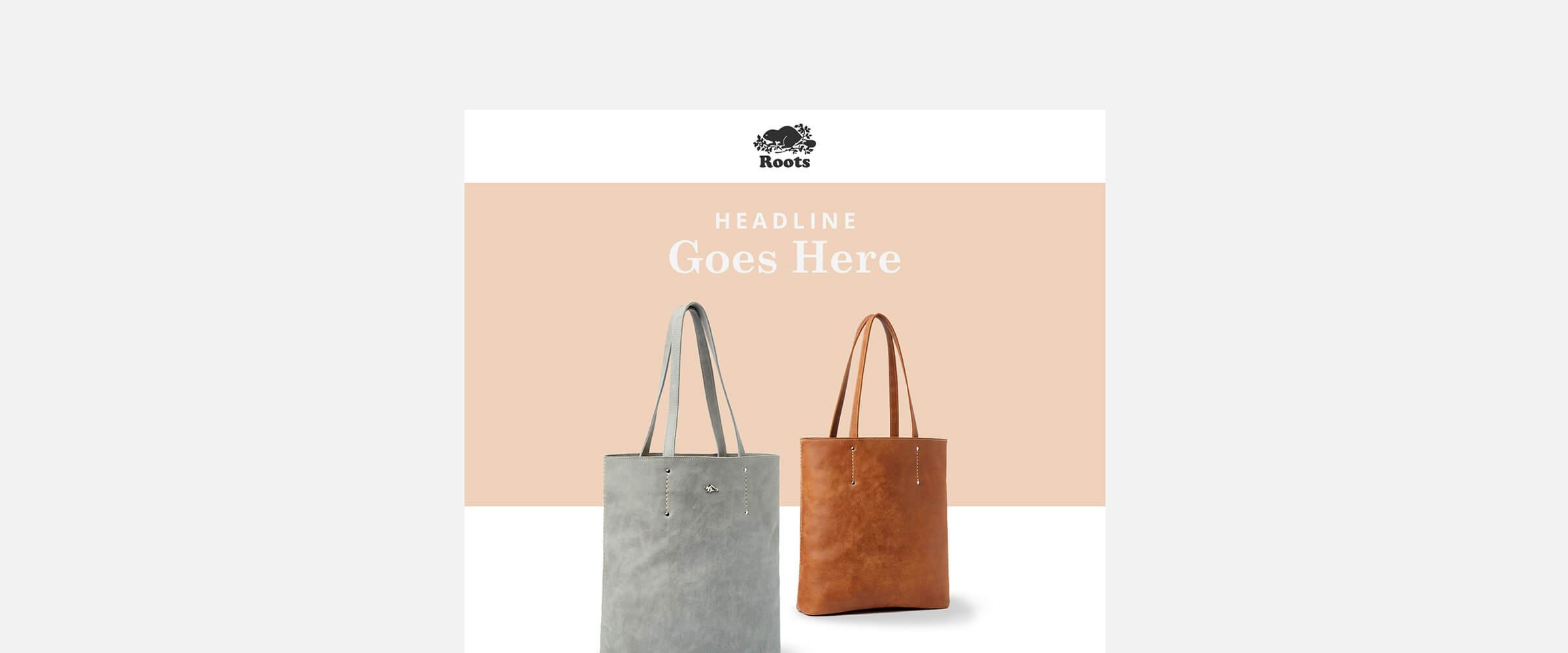
Based on competitor layout styles, I started to explore what similar layouts could look like for Roots. This was meant as an MVP concept to capitalize on assumingely successful content that could be tested and iterated on. There started to be a lot of excitement in my department about the project, including a request from my director to imagine what a dedicated “leather” template could look like.
Informing Decisions With Data
I worked with my marketing leads and product managers to uncover what was currently working for us and what wasn’t. What we realized was our product emails had the lowest engagement, compared to sales and campaign content emails. These were the first emails I decided to redesign. To do so, I reviewed click through and conversion performance, to hypothesize buying patterns over the retail year.
Sadly, we did not have the tools to request direct access to our customers for usability testing, but we did have a customer care team i was able to connect with, and analytic data I could review. I regularly connected with leads to understand our customer’s online behaviour and what the top pain points were for our customers, why click through rates were low and why content wasn’t resonating.
What I uncovered was that customers loved our products, but not so much the price. Digging deeper into marketing segments, I saw we had two distinct customer groups: students and moms purchasing items for their family. I hypothesized that students likely have stronger buying power due to minimal living expenses, where moms had to budget to balance lifestyle and living expenses. This insight told me that we needed better product positioning statements and personalized product features that felt attainable.
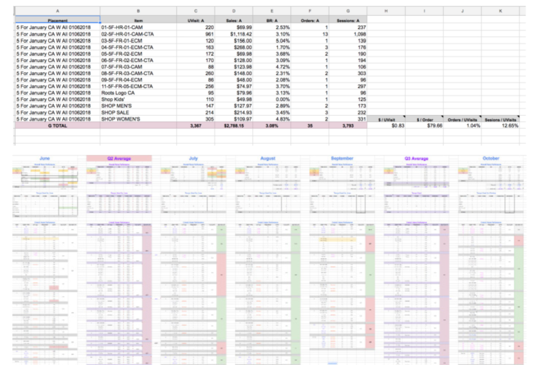
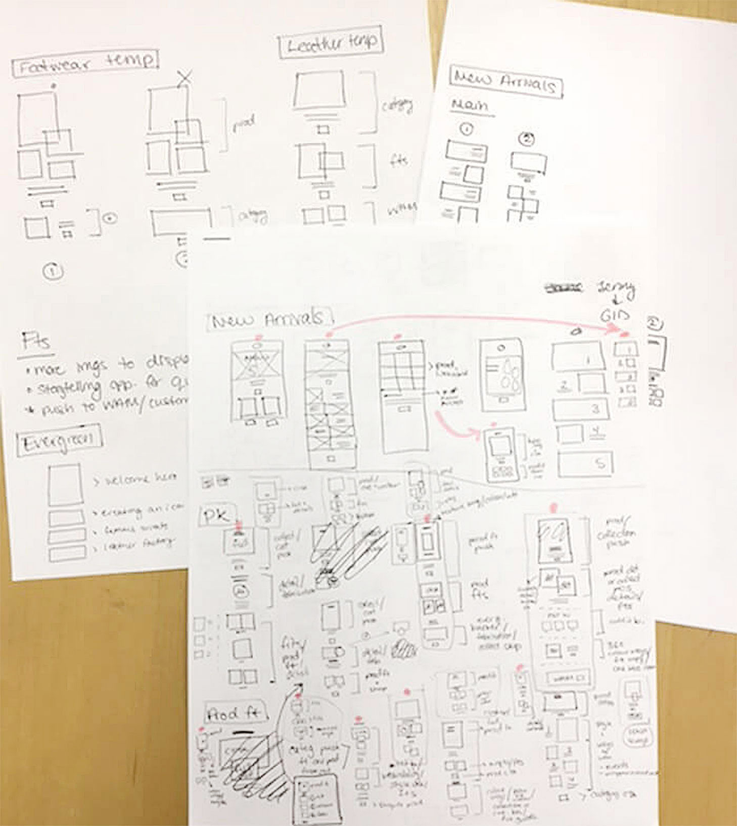
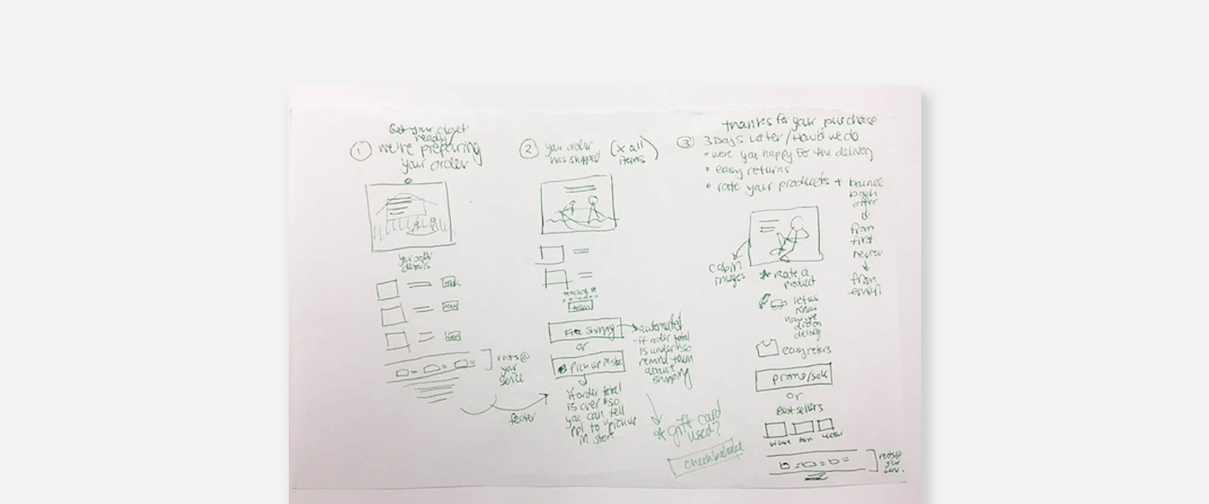
With research in hand, I developed KPI benchmarks, user flow patterns, unique alias naming conventions for tracking, content schedules aligned with photography and product releases, a production cheat sheet, and team workback schedules that meant we could deliver better newsletters with more efficiency.
Through my efforts, we were able to granularly track interactions at every level of Roots’ newsletter experience, right down to which products performed best in which layouts and at what point in the experience. Why was this important? This new way of collecting data meant we could be sure of what content drove customers to the site, pushed interest to other categories and how to personalize content for the best experience.
Redesign
Existing templates were then either scraped, revised or tested further to pull in more user data. I broke down what was performing and what wasn’t, and how our competitors solved similar challenges. Alongside Roots’ analytic and digital marketing managers, together we assessed what could be improved. We updated all performing template designs to be modular, digestible, and inspiring.
The first things I tackled was the header and footer design. One of the biggest, and at the time riskiest decisions was to move the navigation bar to the bottom of our newsletters. I came to this decision after recognizing that customers did not engage with the content in our newsletters because they were immediately clicking on the navigation bar placed at the top. By moving the navigation bar to the footer, customers were able to focus on the content and then shop with informed decisions.
The redesign was done in three phases to ease clients into the transition, reduce financial impact, and help train behaviour.
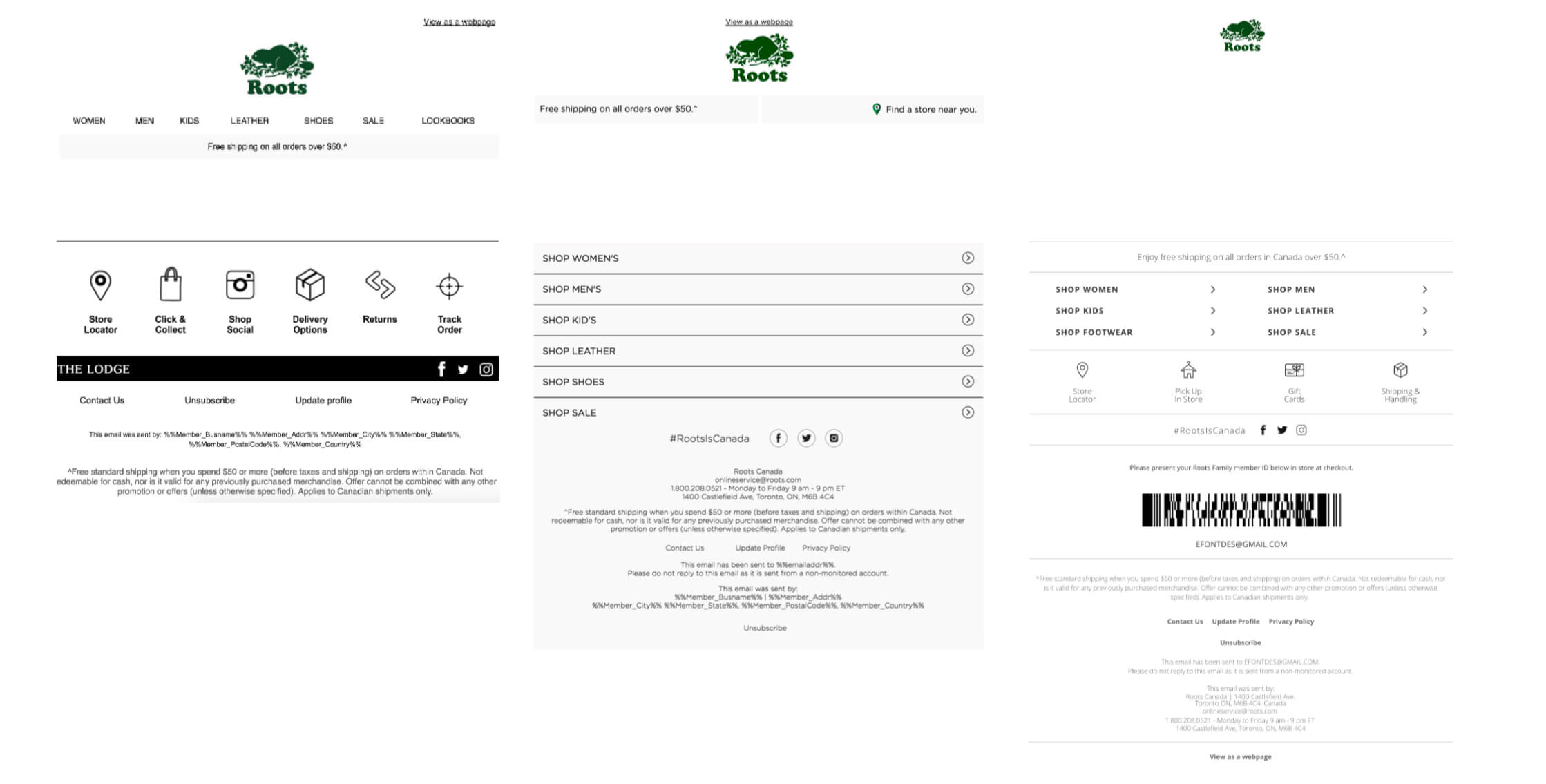
The image on the left was the old design. The logo was too large in proportion to the content, and all the text at top (view as webpage, nav bar, free shipping message) took up 25% of the screen on mobile. Now consider email client headers and native device headers, and suddenly you only have 30% total screen space to sell your products. Not good, if 25% of the 30% space was just text without any products showing…what a bad experience!
In the middle, was the transitional design. The updates were a smaller logo, centred webpage link, unified design style, nav bar moved to the bottom footer section and better use of the top banner space. This new change reduced the size of the header from 25% to 18%.
Finally the image on the end is the final layout. The header now only had the logo, as clients were not engaging with anything other than the logo in the header section of our emails. This change meant that we reduced the size of the header to just 5% of total screen space!
Our Story
A big pain point customers had about our products was that they didn’t know how to combine pieces or how to style lighter weight sweats through the warmer months.
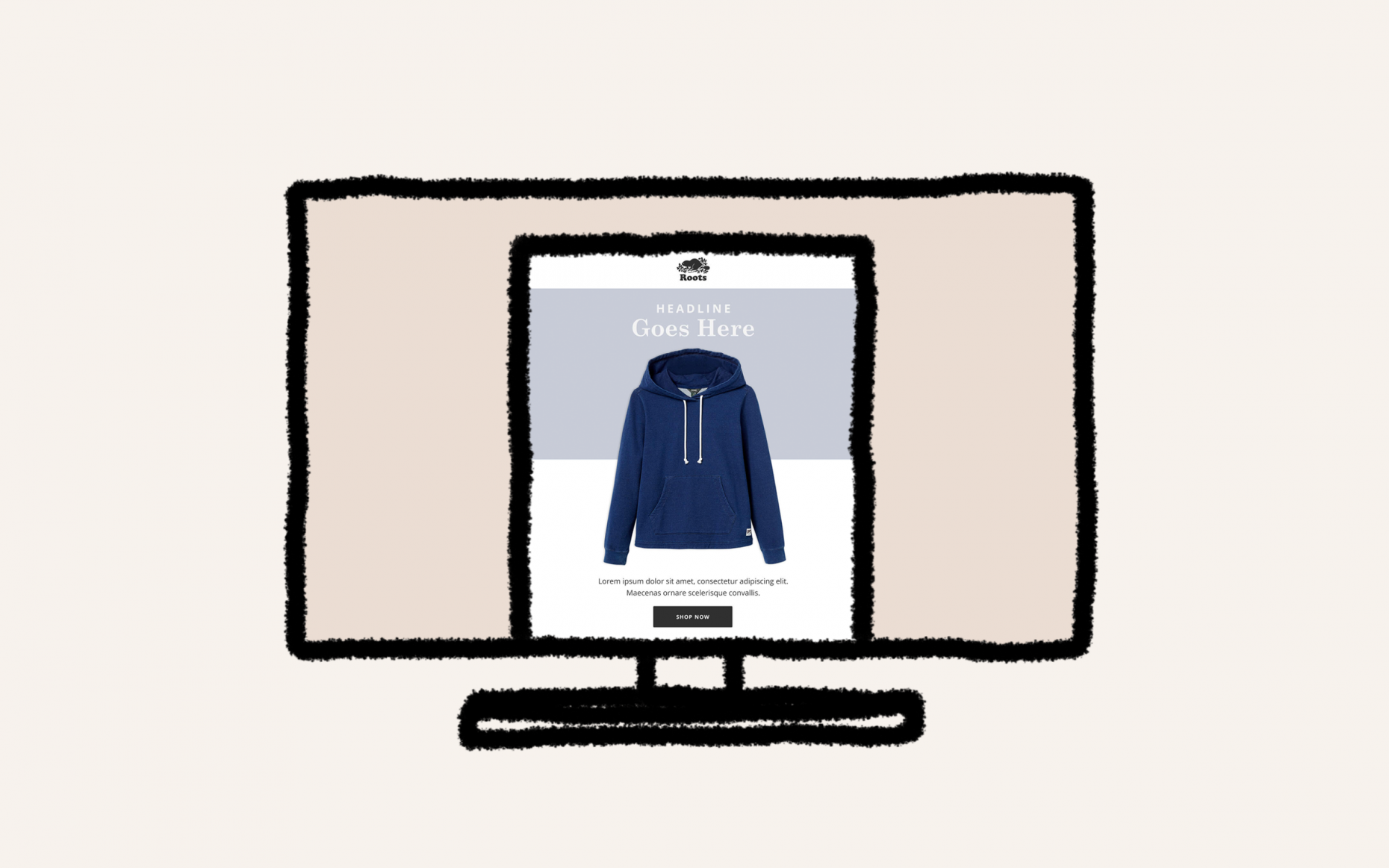
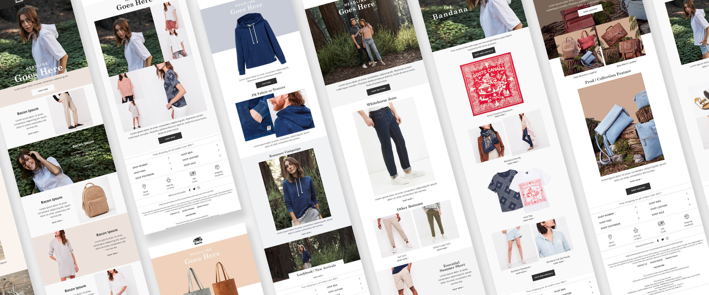
I created templates that were perfect for outfit building, detail shots that explained our more luxurious products and the craftsmanship of how products were created. We assigned purpose to each template by defining how each would be used, and the story they would tell.
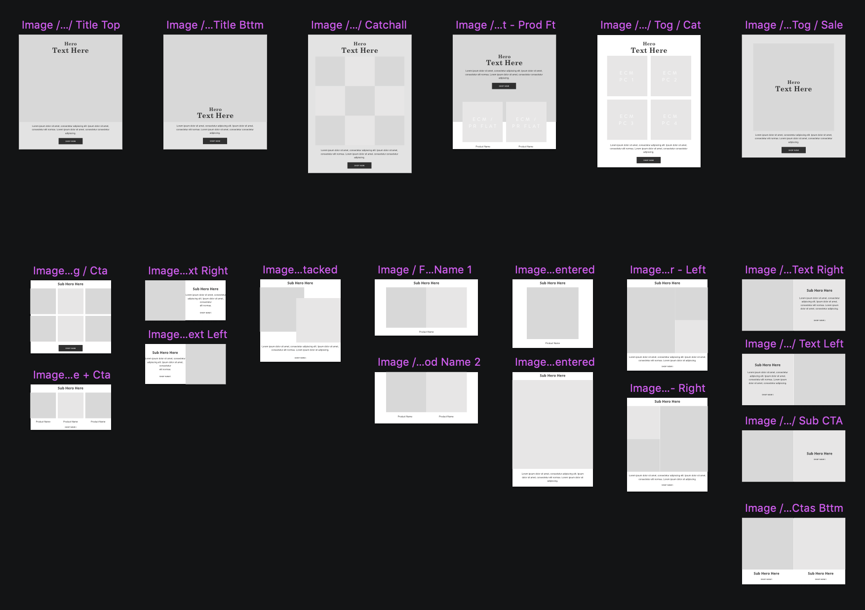
The Power of Modules
Now that we understood the kind of story we wanted to tell, and had tested what clients wanted to read, we needed the flexibility to tell it. So I moved away from templates and created modular designs of our top performing content styles (outlining the top combinations in a brand style guide). I created hero image, product shots, detail sections, banners and outfit building components. It actually made the build process of creating newsletters much more interesting and unique. We also had the added comfort of knowing all these components were backed by data and user testing.