Consistency at Scale
During CIBC’s rebrand, an external agency defined how our Design System would look on signed-in client experience, but not for our public web products. I lead the creation of CIBC’s Responsive Web Design System, which increased vendor and marketing team agility. The design system included a UI Kit, Dev Kit, naming convention standards and document annotation standards, all housed in a single source of truth.
Role: Product Design Lead
Timeline: 7 months
Responsibilities: UX/UI, Design System Creation, Program Management, E2E design
Auditing Current State
Undocumented Components
Through an audit of existing components, I found most had not been documented, especially variances developers made based on constraints, which meant design files were out of date. Interaction patterns were not captured either, so specking all use cases was a big manual effort. I took note of what was missing and ensured to include variants in the new design system.
Reviewing Agency Guidelines
Our mobile app design team was the first team to receive brand guidelines from our agency partner. The mobile app team initiated the creation of a design system, however, design leads were asked to step in to support an omni-channel roll out. My role was leading the responsive web team, where I used atomic design methodologies to format our design system for easy scalability.
Rethinking Documentation
Previous design documentation was inconsistent, cluttered and hard to reference and with visual specks overlaid on designs. I worked with engineers to understand their development process, so design documentation could be more supportive. Our most impactful update was standardizing naming conventions across documents. For example, if bevels were called “radius” in code, then annotations for curved corners were updated to be called “radius”. Aligned documentation meant designers could more seamlessly communicate specs with engineering partners, creating true agile partnerships.
Creating a Design System
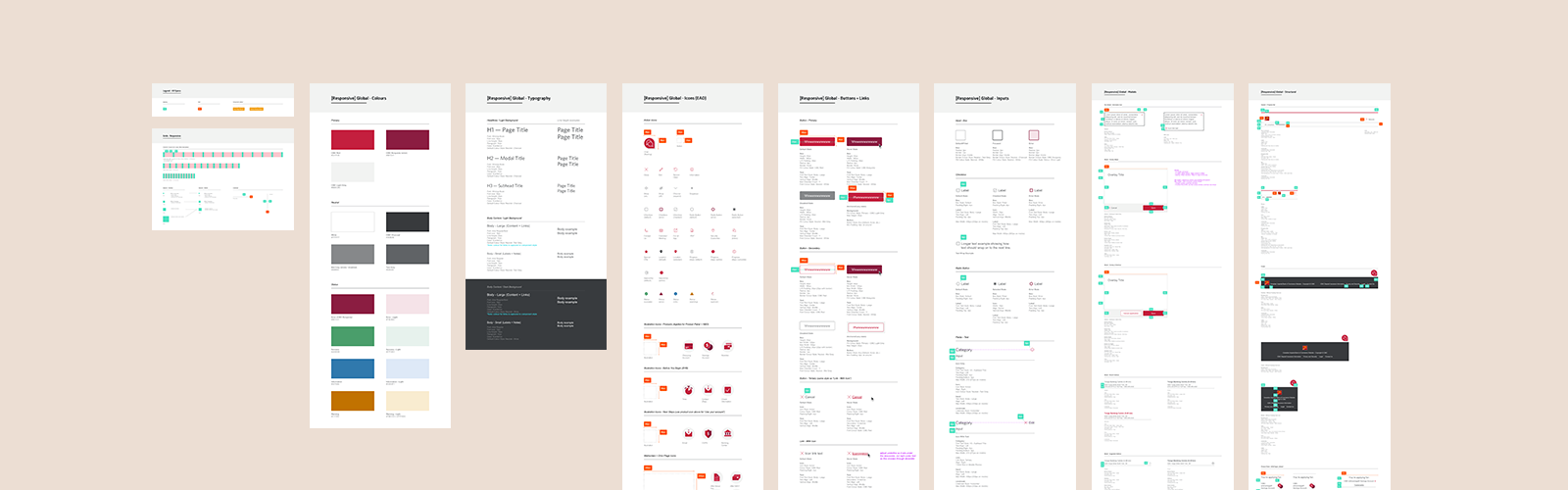
Atomic Documentation
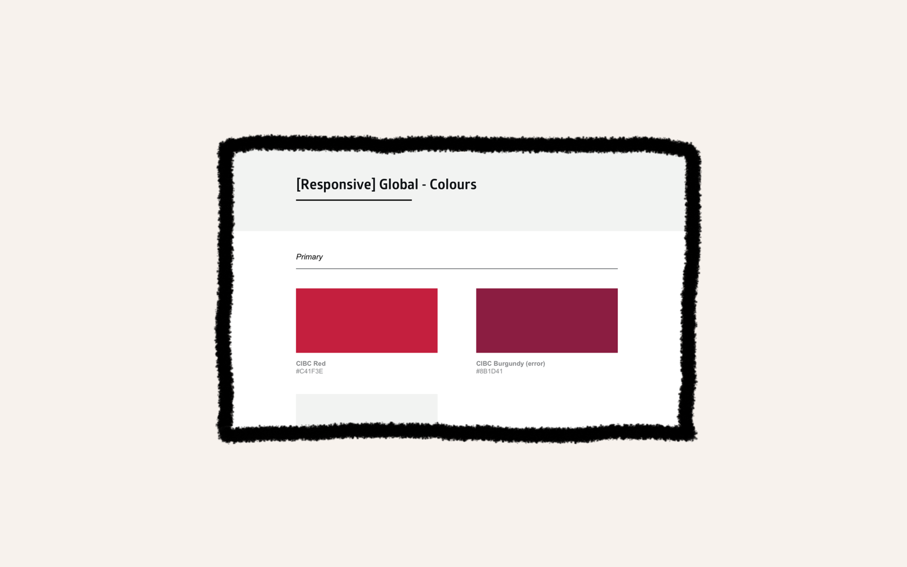
Using Atomic methodologies, I first specked particles and atoms. This included: grids, spacing, typography, colour, line breaks and icons. Next, I defined molecules and components. This included: buttons, link text, inputs, modals, and structural elements like headers, footers and nav bars.
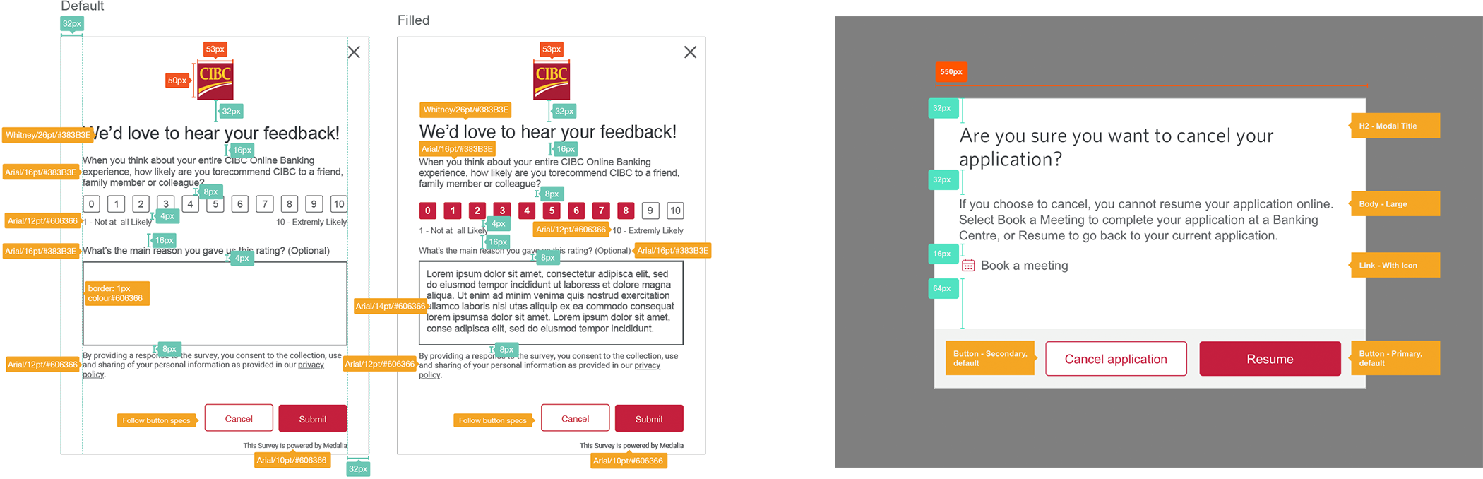
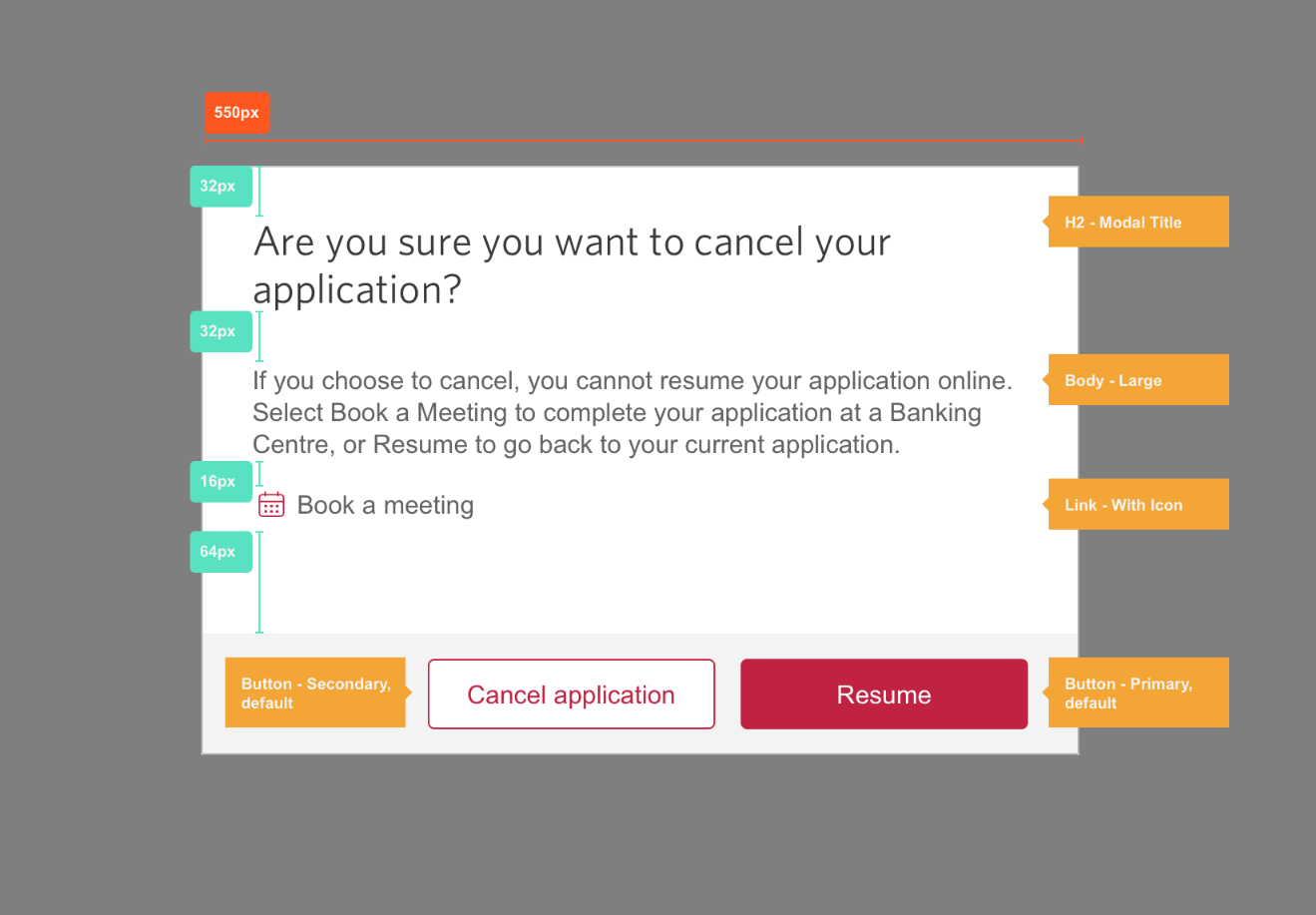
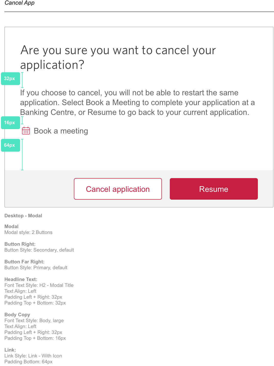
Detailed specks were provided at the lowest “element” level (atoms) and then progressively referenced at higher element levels (molecules and components). This reduced the chance components would have varying styles if built by different developers/designers.
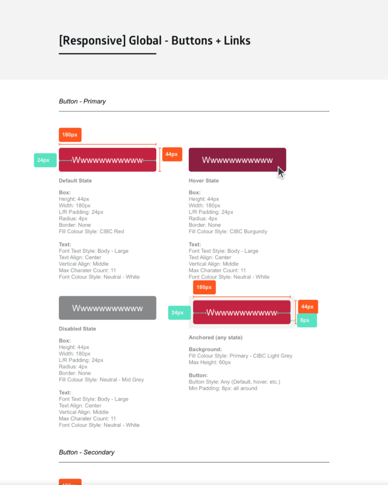
In the example above, buttons have detailed specs below the visual examples, where colours (atoms) are not shown with a #hex number, but rather the element name to force reuse of existing styles. Below, is an example of the next element level, components, that builds off the buttons above. You will notice the style sheet does not spec in detail colours, fonts, size, etc. and instead references the element style names.
Sharable Source of Truth
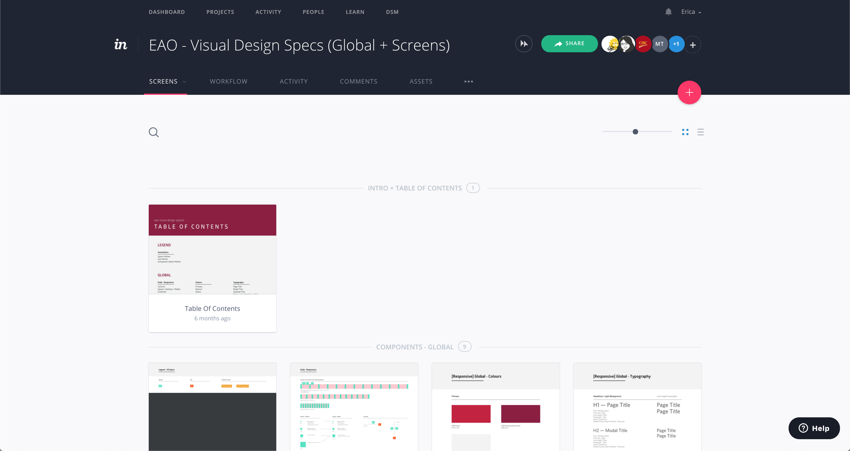
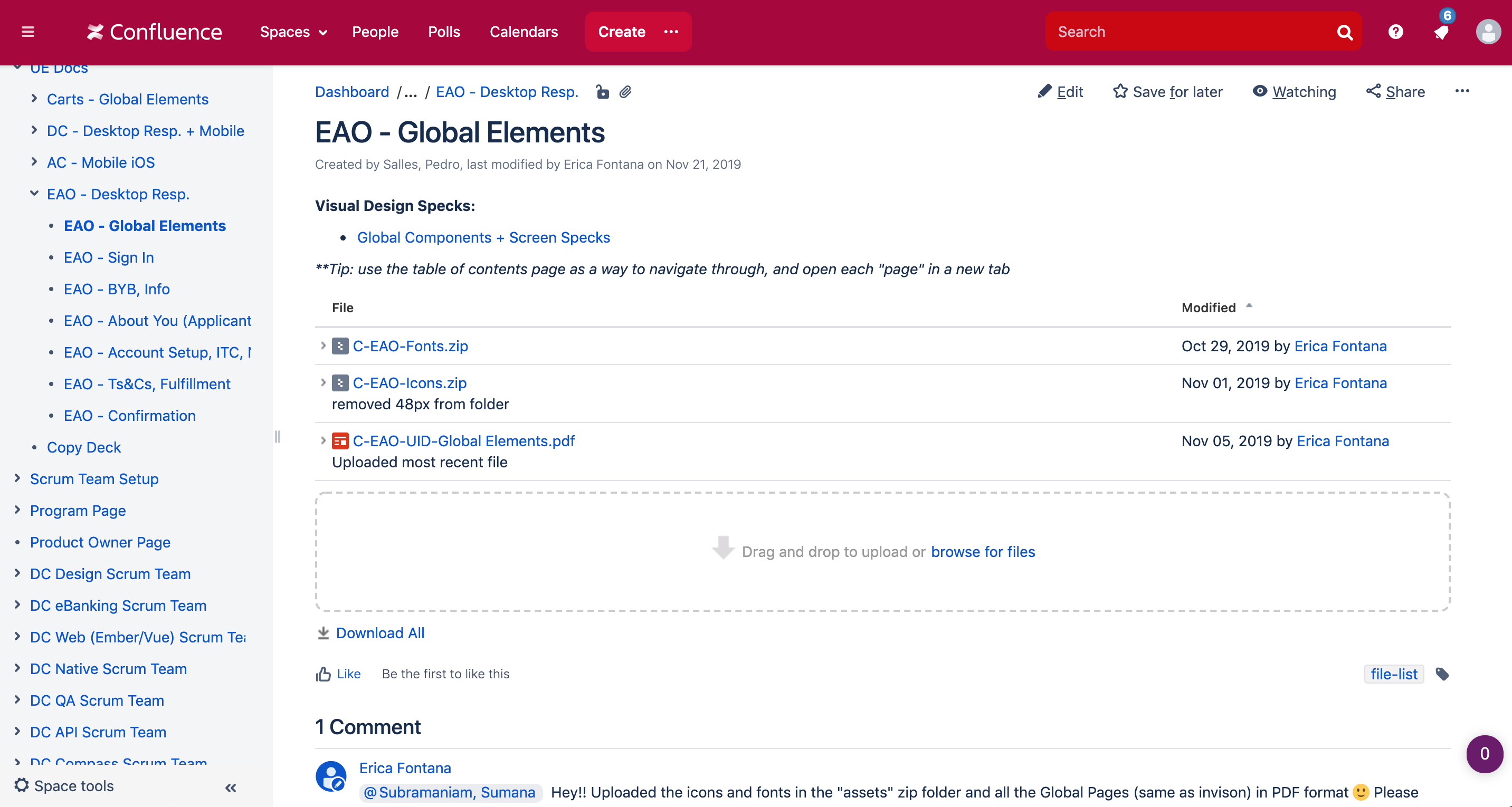
Since multiple business verticals were co-creating a design system, it was imperative that we all communicated updates efficiently. I created a process where style sheets were built in Sketch and published to Confluence and Invision. Design leads regularly reviewed specks together and tracked comments in Invision. This made it easier for our teams to be agile with our updates.
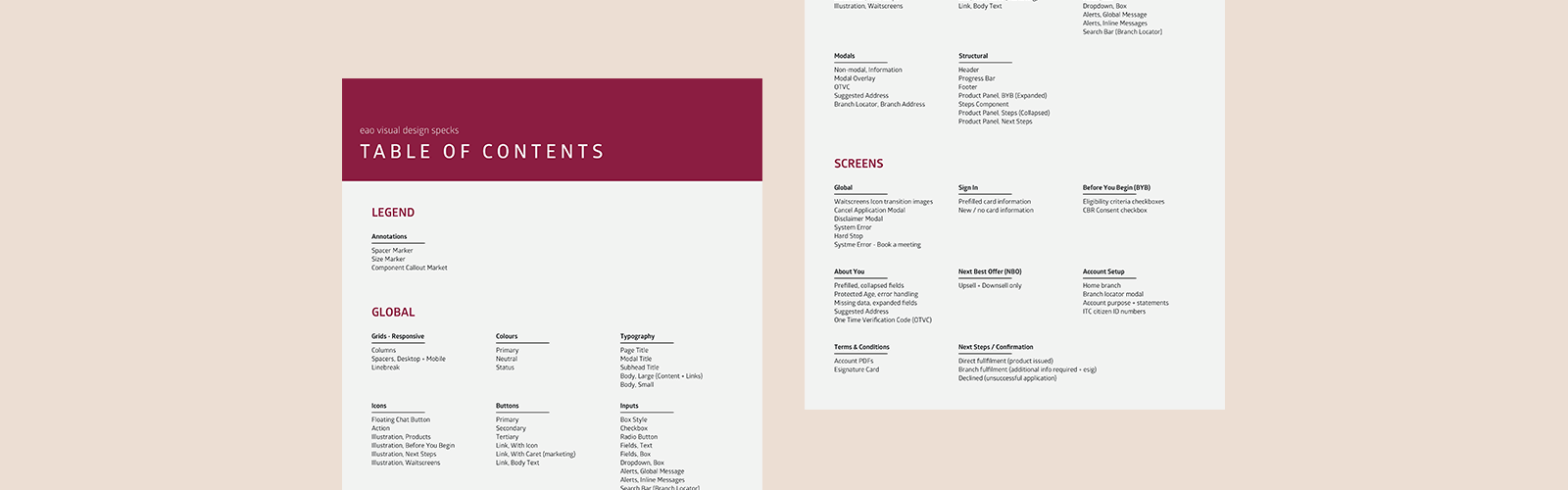
Specs In practise
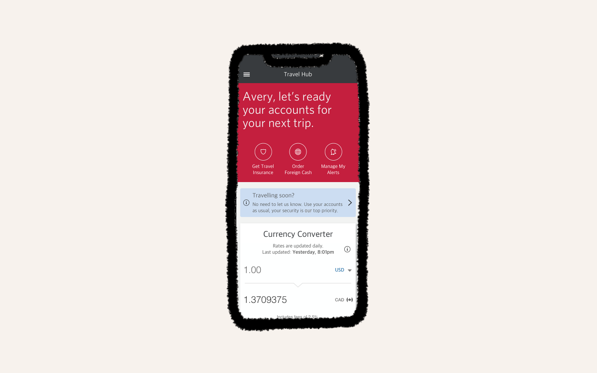
Looking at the team’s roadmap, CIBC’s Express Account Open project was set to launch at the same time as our Responsive Web Design System, so I used EAO as our design system pilot project. This allowed us to stress test process and components in real time.