Financial awareness while travelling
Originally, an external vendor team created a conceptual prototype that looked too similar to a sales page. The concept raised concern, that customers would not trust any in-app travel product recommendations. Ultimately, the concept was repositioned into a “travel companion”, where customers could manage their finances while abroad.
Role: Product Design Lead
Timeline: 3 months
Responsibilities: Team Alignment, Enterprise Product Design Strategy, UX/UI, User Research, Product Roadmap Planning

Current Landscape Audit
The first task I initiated was a Current Landscape Audit. This helped identify the work that had been done to date, and where the gaps were to continue. What I discovered was that the discovery prototype oddly lacked inclusion of the pitch team’s first round of testing; and didn’t address user feedback, pain points or travel needs. I worked with my delivery team to synthesis the early findings, highlighting areas that still needed research.
Closing user discovery gaps

Our team took a trip to Pearson International Airport, where CIBC had several kiosks, and asked advisors about their interactions with clients. This provided us with insight on client behaviour ahead of travel, and upon arrival at different gates (arrivals, domestic and international). This inspired a concept of dynamically sorting content depending on a client’s location and trip mode.
Organizing content
Our field research showed that clients have two main mental modes when travelling. Regardless of the purpose (business or pleasure), clients experience a “planning” and “travel” mode. I lead whiteboard discovery exercises, working with the team to prioritize content, aligning existing products and features CIBC offers, under each mental mode. I then took all suggested components and categorized as sales offering, trip related or banking related. Together with a research team, we used tree and card sorting methods to understand how clients grouped tasked based on their mental mode.
Task Flows
I first built a happy path and then used our client personas to compare expectations and iterate task flows. Originally I thought to consider a first time and re-entry flow, but backlogged for an easier MVP. Decisions for the task flow, were based on mental modes, card sorting results and whiteboard sessions with stakeholders.
Updating the discovery design
Next came the iterations that took the POC discovery mock designed by CIBC strategy team, and built a technically feasible and user-centric MVP design. Through rapid prototyping, I worked with my team to create a new design. The design was used in demos to help stakeholders visualize the improved flow, and provide feedback on the new direction.
Some key decisions were to remove the weather widget, since clients deemed unnecessary within a banking app, card grouping for content hierarchy, a personalized welcome message to excite users and dynamic card sorting based on mental modes.
We incorporated feedback from Discovery, to refine the draft prototype and I continued to lead a testing strategy and team collaboration.
Offline support
Our biggest tech consideration, was how to display content within the Travel Hub if clients turned off their mobile data. This was a common scenario with travellers wanting to avoid roaming fees. Together, we listed which features could be cached and date stamped, and which features couldn’t display without data.
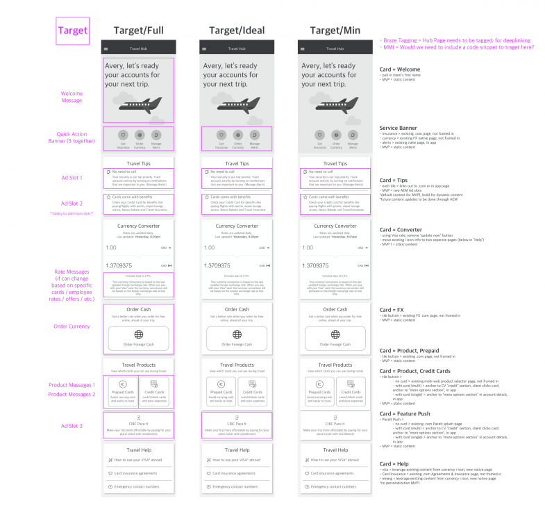
A pivotal breakthrough was when I connected with our marketing team about analytic tracking. The team mentioned the promo slots they wanted to show in the Travel Hub used Adobe Experience Manager (AEM) cookies to target and track behaviour. Probing a bit more, the team mentioned cookies could definitely be cached along with personalized messaging if within AEM. With this insight, we completely rethought the marketing team’s strategy and solved our “offline” behavioural issue!
I worked with POs and PMs to get the appropriate buy-in from stakeholders; speaking to the opportunity of fully personalizing content even if data was turned off. This meant richer experiences for our clients, with carefully crafted purchase moments. I took it one step further by showing the team how we might scale the experience from a GTM minimum target state to fully targeted.

GTM to North Star
I lead the product team to understand the project roadmap, and build foundational components for future flexibility. We needed to deliver against an aggressive timeline, but thankfully the team had appetite to scale so I was able to plan design releases over iterations.
One of the main considerations for us to scale the experience was to include quick links within the hero card. The strategy team originally suggested quick links based on Aventura card holder options (ie. travel assistant, coverage, etc.). Due to complexity, our development teams were not able to provide for MVP, but I discovered a way to iterate to in the future. By starting with a default version of the area to train usage behaviour, we could track performance and engagement, and have the widget available for future integration with credit card specific data. AND, becuase the section would be managed in AEM, we could easily update content and allow AEM to reorganize based on CIBC campaigns and performance.
Launch
We had gone through VD, development and QA, ready to launch ahead of summer vacation. However, on the eve of our launch we had to postpone due to COVID-19. The team repurposed the strategy for a security hub in 2022.


